How to Create a Pink and Gold Girls Bathroom Aesthetic
A pink and gold girls bathroom tends to land in one of two places. One looks like a magazine shoot. The other looks like a dollar-store bag got emptied onto the counter. Two colors, totally different results, and it isn’t about how much you spent. It’s about which choices you make and when. The warm-pink hex codes that actually look expensive, the one gold rule that keeps things from clashing, the buying order that stops new stuff from fighting what you already own. That’s the whole guide. Let’s get into it.
Disclosure: This post contains affiliate links. If you buy through them, we may earn a small commission at no extra cost to you.
Step 1 — Decide Whose Bathroom This Is Before You Buy Anything
The pink that delights a 7-year-old will mortify a 15-year-old by next summer. That one fact, more than any pink and gold bathroom ideas you save, will save you the most money. Settle who actually uses this room before anything else, because that answer shapes every choice after it.
A young child’s bathroom can handle playful, brighter pinks and washable surfaces that hide toothpaste splatter. A tween usually wants something a little grown-up but still fun. Teens lean toward calm, mature, almost spa-like tones with very little “cute” left in them.
Permanence matters as much as the color does. Paint and removable tile cost almost nothing to swap when her taste changes. Tile, vanities, and fixtures are a different story.
So put your most permanent pieces toward the look that will last the longest. Save the trendy, easy-to-change stuff for whatever stage she’s in right now.
Shared bathrooms come with one extra rule. Pick tones that more than one kid can actually live with. If you’re working on a space like that, our guide on the Best Bathroom Decor Ideas for a Tween Shared Girls Space digs into layout and storage. Once you know who the room is for, every later decision turns into a quick yes or no.
Step 2 — Confirm the Look Is Current: The 2026 Pink Bathroom vs. the Dated One
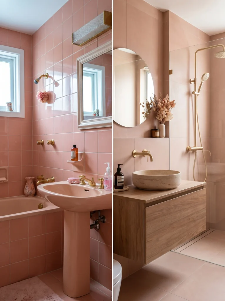
Pink bathrooms are back, and they look nothing like the ones people are scared of. The whole difference comes down to undertone. Old pink read cold, glossy, and clinical. New pink reads warm, soft, and a little earthy.
That 1980s bathroom you’re picturing covered every wall, floor, and tub in bubblegum or salmon tile. These days designers treat pink as a warm neutral instead. Think plaster, clay, and rosy beige rather than candy.
Warmth is the secret. A blush with a beige or peachy base feels modern and expensive. A pink with a blue or purple base feels dated the second it goes up.
This warm, muted, nature-inspired direction is one of the strongest things happening in bathrooms right now, and it pairs naturally with materials like wood and stone. You’re not chasing a fad. You’re stepping into a look designers are already pushing hard, which means matching pieces will be easy to find while you shop.
Step 3 — Lock the Bones First: Tile Format and the One Gold Finish
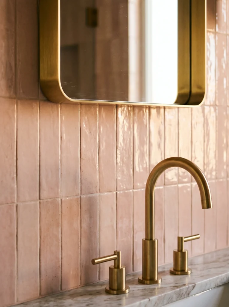
Decide your tile and your metal finish before you buy a single towel. Everything soft gets matched to these two things, not the other way around. Get that backward and nothing will line up.
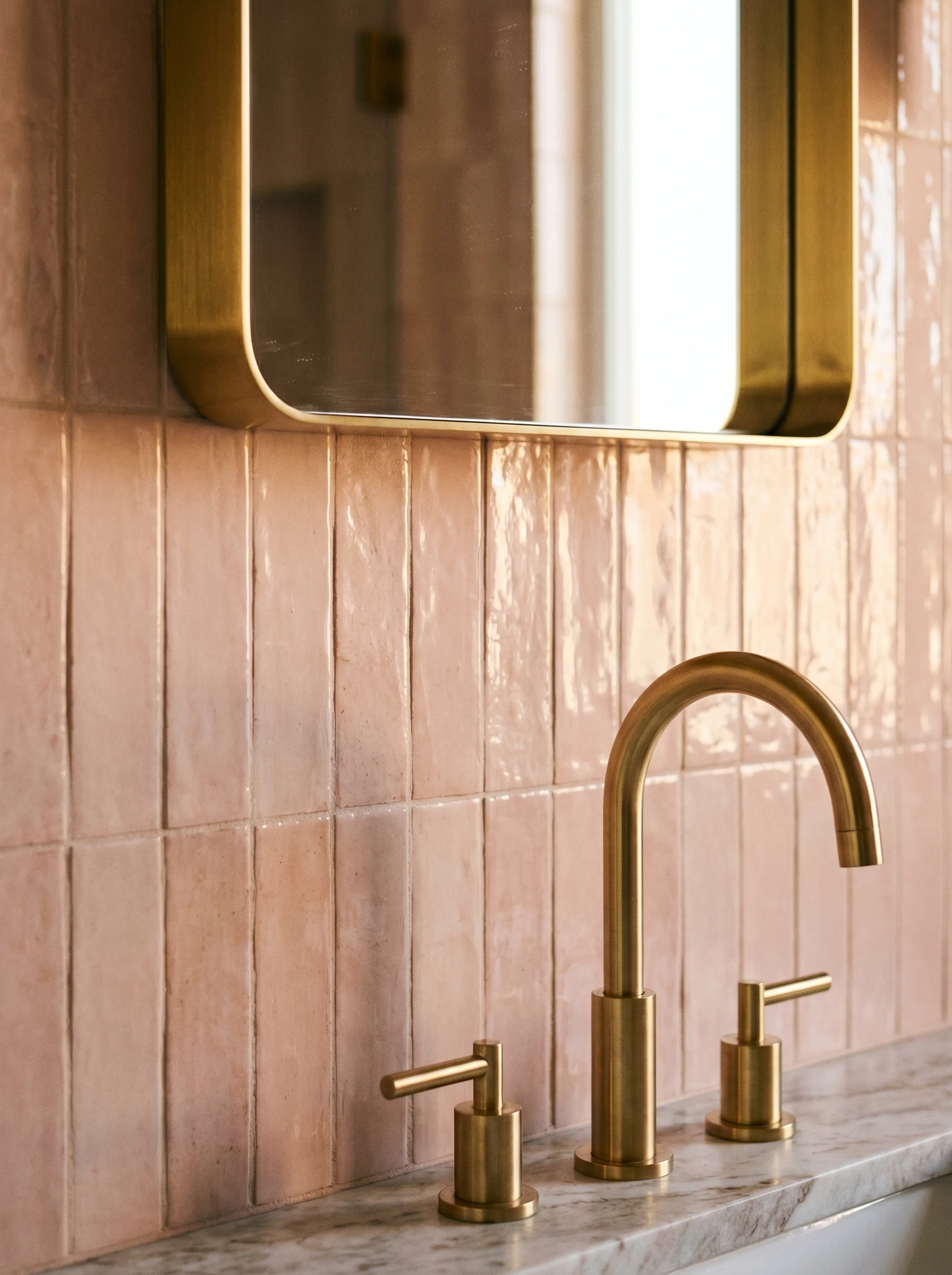
Start with tile. Skip the wall-to-wall solid pink. Let it live in a controlled format instead: a vertical-stacked blush subway tile behind the vanity, a band of pink zellige with that handmade glossy shimmer, or terrazzo flecked with soft rose. Renting, or just nervous about commitment? Peel-and-stick pink subway tile like the VEELIKE Pink Subway Peel and Stick Backsplash gives you the look on one wall and peels off later without wrecking the surface.
Shop it from amazon : VEELIKE Pink Subway Peel and Stick Backsplash
Now the gold. Choose one finish and repeat it on the faucet, the lights, the hardware, and the mirror frame. Brushed gold is soft and hides fingerprints. Polished gold is shiny and bold. Champagne bronze is muted with a warm, beige-gold tone that sits beautifully against warm pink.
One more thing to avoid: cold, flat pinks and high-gloss primary shades on the walls. They look cheap and age fast. Warm and matte wins. With the bones set, you can finally add color and trust it.
Step 4 — Set the Pink with the 60-30-10 Rule and Exact Hex Codes
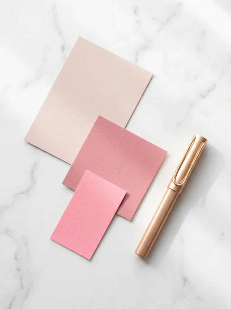
Most rooms that clash break one simple rule. They use three pinks at the same strength, so nothing leads. The 60-30-10 split fixes that, and it works every time.
Sixty percent is your dominant tone. This is the calm base on your biggest surfaces, like walls and large tile. Use a soft, warm neutral-pink near #F4E1E1 or a slightly deeper #EAD5D1.
Thirty percent is your secondary color. It carries the vanity, a tile band, or a shower curtain. Reach for a richer rose like #C98B8B to give the room some depth.
Ten percent is your accent. Keep it small and punchy and use it sparingly, on towels, a tray, or a piece of art. A brighter blush like #F7CAC9 does this job nicely.
Walk the room and assign each surface a number before you spend anything. The biggest things get the lightest, calmest pink. The smallest things get the boldest. Drop those three hex codes into a phone note and every purchase after that stays on track.
Step 5 — Add the Colors That Make Pink Look Expensive (and Avoid the Ones That Cheapen It)
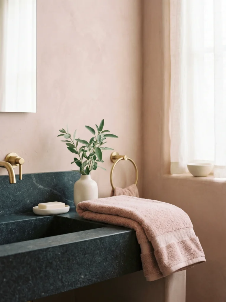
Pink rarely looks expensive on its own. It needs a partner, and the right partner is what separates a styled room from a flat one. Gold is the first and best choice, which is the whole reason this aesthetic exists.
Warm white keeps pink feeling fresh and clean. Sage or olive green makes it feel grown-up and calm. Charcoal or deep brown grounds it so the room feels anchored instead of floating. All three read as deliberate and high-end.
If you want pink to actually pop, set it next to one of those grounding tones. A blush towel against charcoal stone looks far richer than blush sitting on more blush.
A couple of colors fight pink and should stay out. Cool blue-grays clash with warm pink and turn it muddy. Bright orange-red just competes for attention and looks loud. Expensive bathrooms almost always share one trait anyway: a tight, restrained palette. Three or four colors used with discipline will beat a rainbow every time. With your partners chosen, the room is ready for the layer most people forget.
Step 6 — Layer Texture So It Photographs With Depth, Not as a Flat Pink Wash
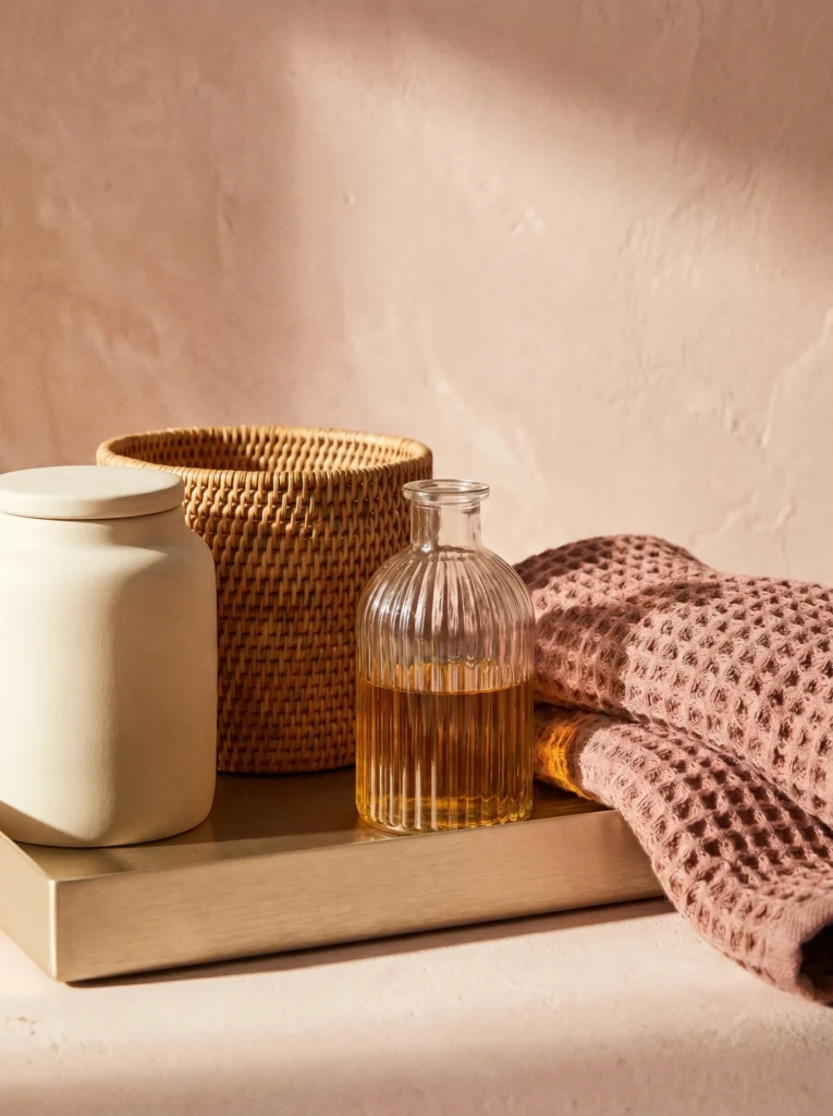
A room can have a perfect palette and still fall flat in photos. Texture is the reason, and almost no decor article brings it up. Get this part right and the space looks Pinterest-ready instead of painted-on.
Flat means every surface is smooth and basically the same. Depth means your eye has different materials to move across, and that contrast is what makes a phone photo look styled.
Mix at least three textures on purpose. Set matte ceramic against shiny gold. Put a woven rattan basket near cool marble. Add fluted glass on a jar or a light fixture for soft little ripples.
Soft goods pull a lot of weight here too. A chunky waffle-weave towel and a plush bath mat bring a warmth that hard tile never will, and each one catches the light differently.
Stand back and ask yourself one question. Is everything smooth? If the answer is yes, add something woven, something matte, and something soft. The palette gives you the color. Texture gives you the photo.
Step 7 — Buy in This Exact Order So Nothing Clashes
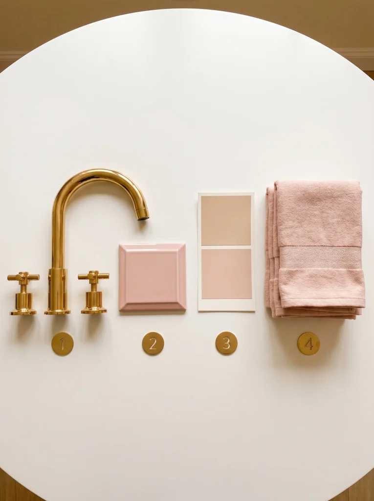
Buying soft goods first is the single mistake that wrecks pink-and-gold bathrooms. You match towels to a faucet, not a faucet to towels. Follow the right order and clashing becomes almost impossible.
Buy the permanent finishes first. Faucet, lights, hardware, and mirror frame, all in your one chosen gold. A coordinated bundle like the TRUSTMI Brushed Gold Faucet and 4-Piece Bathroom Hardware Set locks your metal down in a single purchase, so nothing drifts off-tone later.
Shop it from amazon : TRUSTMI Brushed Gold Faucet and 4-Piece Bathroom Hardware Set
Tile and large surfaces come next, in your dominant and secondary pinks. Then paint, matched to those exact hex codes.
Soft goods come last. Towels, mats, curtains, and your bold accent blush. By the time you get here, everything you buy already has something to match.
Run a quick check before you tap buy. Does it match the gold finish? Does the pink fit one of your three hex codes? Two yeses and it earns a spot in the cart. That little checklist is what kills the random-haul problem for good.
Step 8 — Style the Final 10%: The Counter, Wall, and Storage Details That Sell the Aesthetic
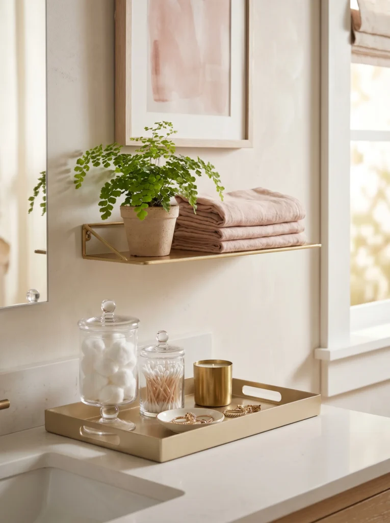
The last ten percent is what makes people assume you hired someone. Coordinated pieces only look intentional once they’re styled, and styling takes minutes. This is the payoff.
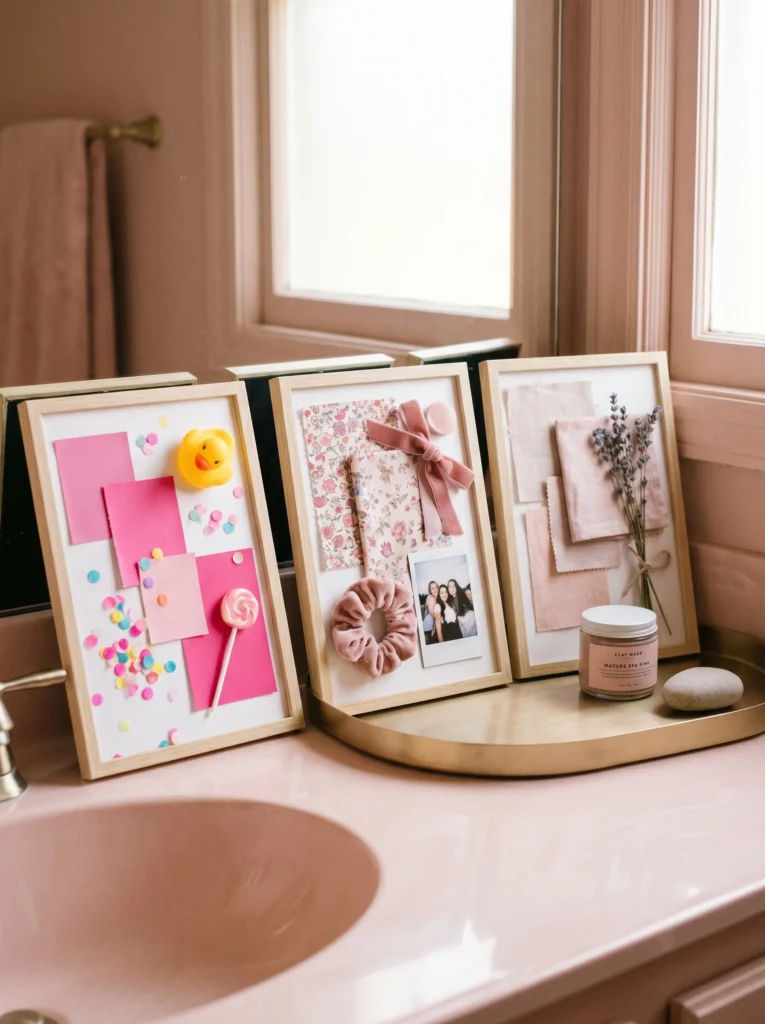
Group your counter items on a single tray instead of scattering them around. A gold-edged tray pulls everything into one tidy moment. Decant cotton balls and swabs into matching glass jars so the cheap packaging disappears.
Give the walls a job too. Hang framed art in your palette, or a round mirror with a thin gold frame. A small set of gold floating shelves can hold a plant, a candle, and a folded towel as a little styled trio.
Then tuck the messy stuff away. Woven baskets hide hair tools and spare rolls while adding warm texture at the same time. Keep your counters about two-thirds empty so the room can breathe.
Step back and take a photo. The picture will show you instantly which corner still needs one small, beautiful thing.
The Pink and Gold Colors You Should Never Put in a Bathroom
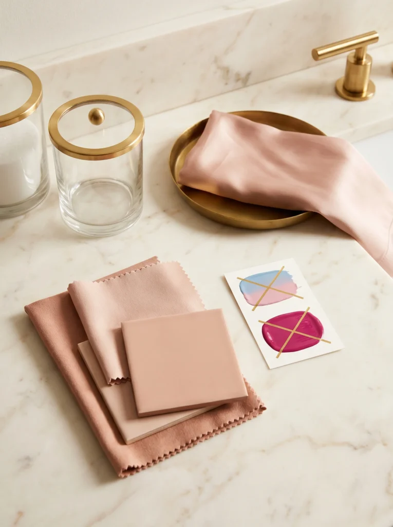
One wrong pink can sink the whole room, so a short avoid-list protects everything you’ve built. The danger is rarely pink itself. It’s the wrong version of it.
Skip cool, blue-based pinks. They go gray under bathroom lighting and end up feeling cold and cheap. Magenta and hot bubblegum are too loud for a calm space and read childish fast. Stay away from high-gloss primary pink too, because shine on a bold color magnifies every single flaw.
Keep an eye on your white as well. A stark, blue-white clashes with warm pink and makes it look dirty. Go with a soft, creamy white instead.
Gold has its own trap. Mixing finishes is the fastest way to look like you didn’t mean to. A polished faucet next to brushed hardware next to a champagne mirror reads as an accident, not a choice.
One test settles most of your doubts. Hold a sample under your real bathroom light, not the store light. If the pink looks gray or the golds don’t agree, walk away. That five-second check is a lot cheaper than a return.
How to Get the Pink and Gold Look in a Weekend Without Renovating
You can get most of this look without touching the tile or calling anyone. If you rent, or you’re just watching the budget, two days and a handful of removable pieces will get you there.
Start with the wall behind the vanity or the tub. Peel-and-stick blush subway tile goes up in an afternoon and comes off clean when you eventually move. If that still feels like a lot, removable pink wallpaper does much the same job with even less fuss.
Then swap whatever unscrews. A faucet, a mirror, the drawer pulls, a light fixture, all doable in one Saturday, and getting them onto a single gold finish is what shifts the room the most. Can’t touch the faucet because you rent? A gold faucet cover or some stick-on gold trim gets you most of the way.
Save the soft stuff for Sunday. Hang towels in your accent blush, throw down a bath mat, set out a few glass jars and a gold tray, add a small plant. All of it packs up and moves with you whenever you do.
By Sunday night the room actually reads pink and gold, and you got there with a screwdriver and a free afternoon.
Your Pink and Gold Girls Bathroom Starts With One Decision
You don’t have to renovate this weekend. Pick one step and do it. Tape your three pink hex codes to a phone note, or choose your one gold finish and commit to it. That single decision makes every choice after it easier, and the room starts coming together on its own.
Want to come back to this later? Save this pin to your bathroom board so the steps, hex codes, and color rules are one tap away when you’re ready to shop or style. Pin it now, start with one decision, and build the pink and gold girls bathroom you actually pictured.
Table of Contents
For more bathroom color palettes and design aesthetics to pull inspiration from, see our guide on brown and beige warm neutrals that actually work.