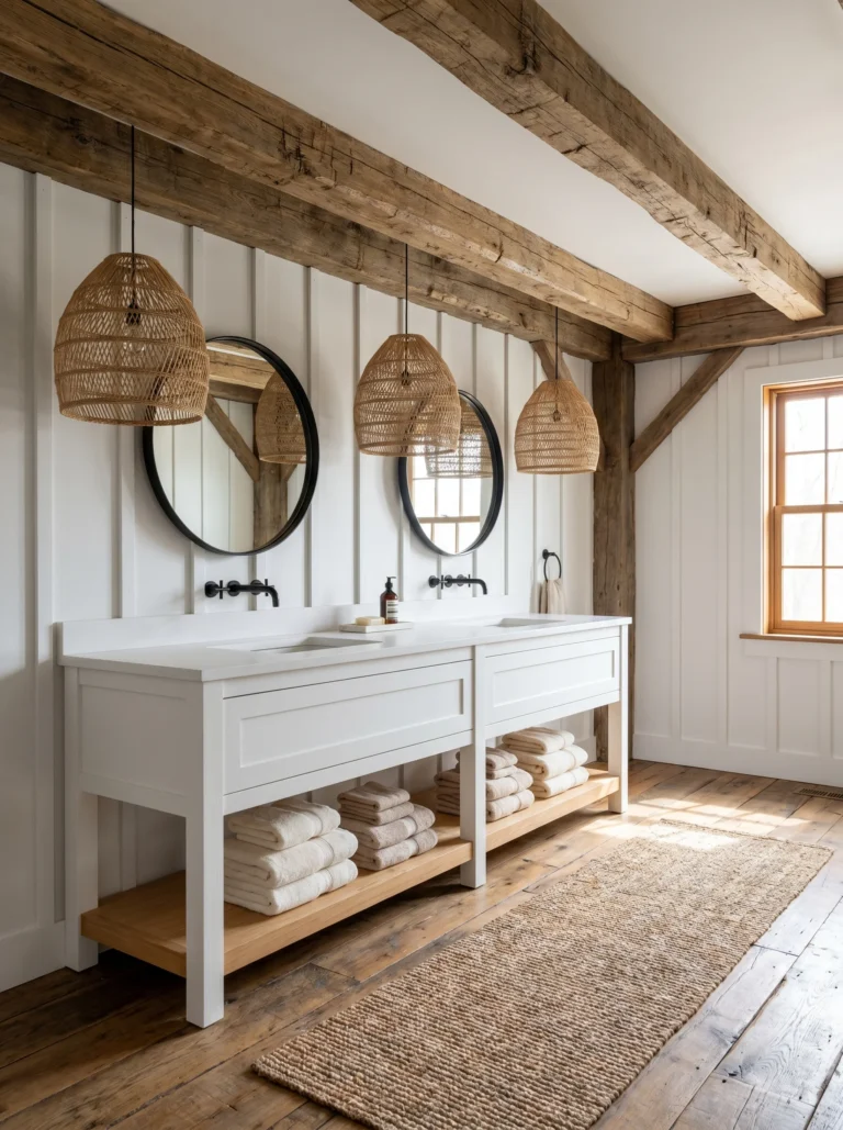
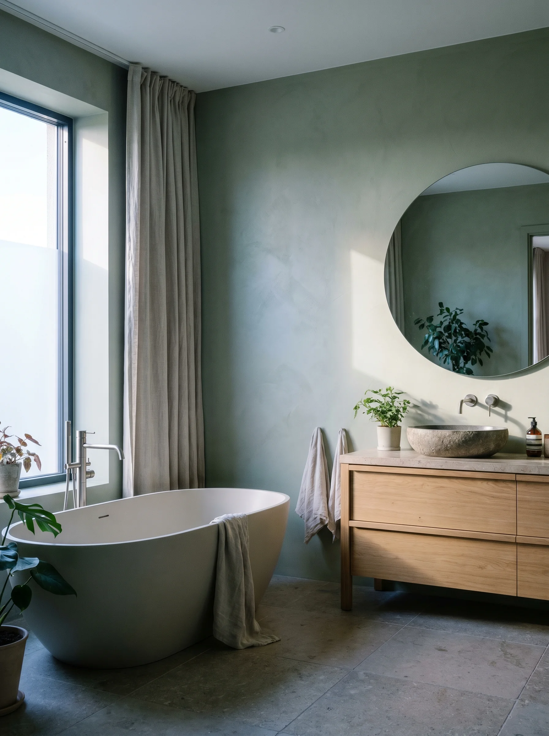
Earthy Green Spa Bathroom: How Green Tones Create a Calm Color Vibe
Walk into a good spa and your shoulders drop before you’ve thought about why. The color did part of that work. An earthy green spa bathroom borrows the same trick, and the reason it works has almost nothing to do with picking a pretty shade. Green sits in a sweet spot for the human eye. We evolved around it, and it reads as safe. Your eye relaxes instead of straining to make sense of what it sees.
Color researchers have a name for this pull toward nature: biophilia. Spend time near plants, water, and natural light and your body tends to settle. Green is the strongest color cue for that whole world. A muted, grounded green tells your nervous system “you’re outside, you’re fine” even when you’re standing on tile. That response is why a sage green bathroom wall calms a room that a bright blue wall would only brighten.
Here’s the part most people miss. The calm doesn’t come from the green being green. It comes from the green being quiet. A loud, candy green won’t relax anyone. The spa feeling lives in how soft and grounded the color is, and the rest of this guide is about getting that softness right.
This post contains affiliate links. If you buy through them, I may earn a small commission at no extra cost to you.
Why a Spa Feel Comes From Muted Saturation and Low Contrast, Not the Hue Itself
Saturation is how pure or intense a color is. A traffic-cone orange is high saturation. The same orange dusted with gray turns into terracotta. Spa green lives way down at the low end. Take the gray out and even a lovely sage starts to shout. Keep it in and the wall recedes, which is exactly what you want a calm room to do.
Contrast is the other lever, and it matters just as much. Contrast is the jump between your lightest and darkest surfaces. Spas keep that jump small. Walls, floor, and trim sit close together in tone, so your eye glides instead of bouncing. Picture a sage wall next to crisp bright white trim and jet-black hardware. That’s high contrast. Your eye snaps to every edge. Now swap the white for a soft off-white and the black for warm brass. The whole room exhales.
This is the rule that does the heavy lifting. Pick one earthy green, then build everything else within a few shades of it. Low saturation, low contrast. Get those two things right and almost any green in the family will feel like a spa. Get them wrong and the prettiest paint chip on earth still won’t.
Want a louder, higher-contrast direction for a different room? My guide on how navy and gold create a modern glam bathroom color scheme goes the opposite way on purpose, and seeing the contrast helps the spa logic click.
What “Earthy” Means: The Warmth and Muddiness That Separate Spa Green From Cold Mint
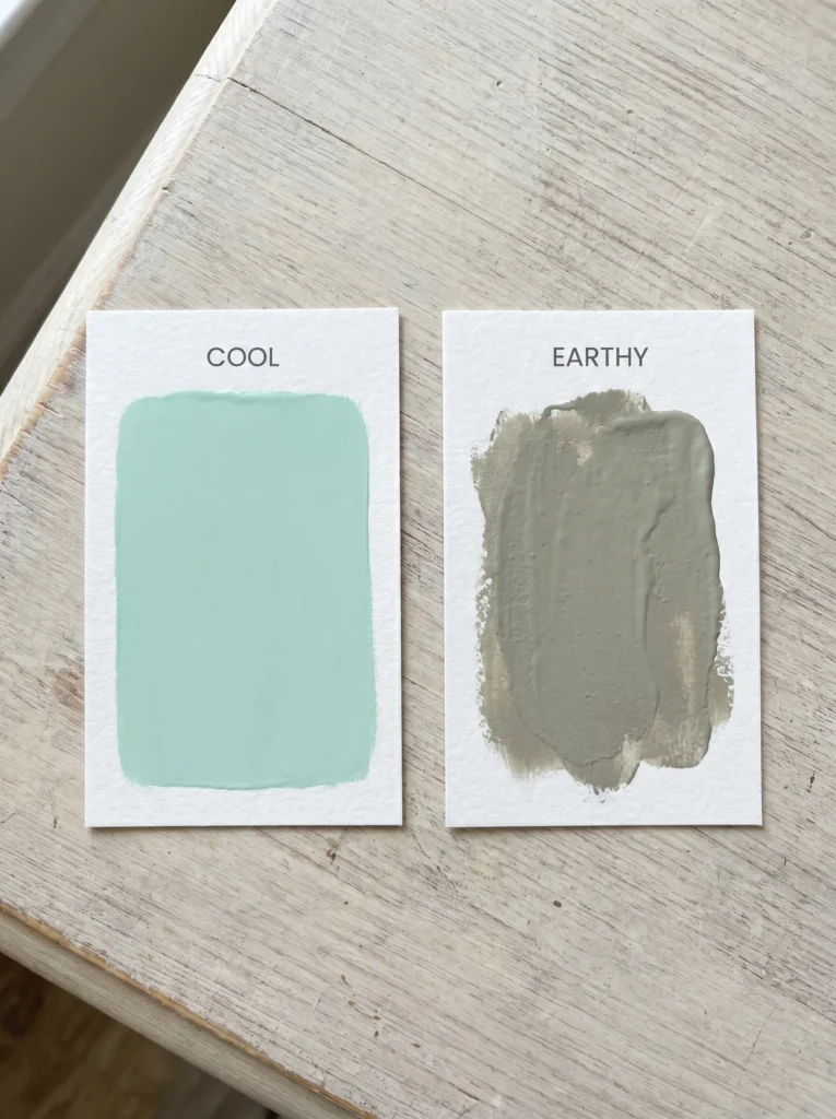
Two greens can sit right next to each other on a chip and feel like opposite moods. The difference is what’s mixed into them. Mint green has a cool, almost minty-blue base and a clean, bright quality. It reads fresh, a little clinical, slightly cold. Earthy green has gray, brown, or yellow stirred in. That muddiness is the whole point.
Think of the colors you actually see outdoors. Moss on a rock. Dried sage. The gray-green of an olive leaf. None of them are pure or bright. They all look a little dirty, and your eye trusts them because of it. That trust is the warm, grounded feeling people mean when they say “earthy.”
You can train your eye to spot it fast. Hold a green chip and ask one question: does this look like it was just unwrapped, or does it look like it has been sitting in the sun? Fresh and clean leans cold and modern. Faded and a touch muddy leans earthy and calm. For a spa, you want the one that looks slightly sun-worn. That single test will save you from buying a green that turns out cold the moment it’s on the wall.
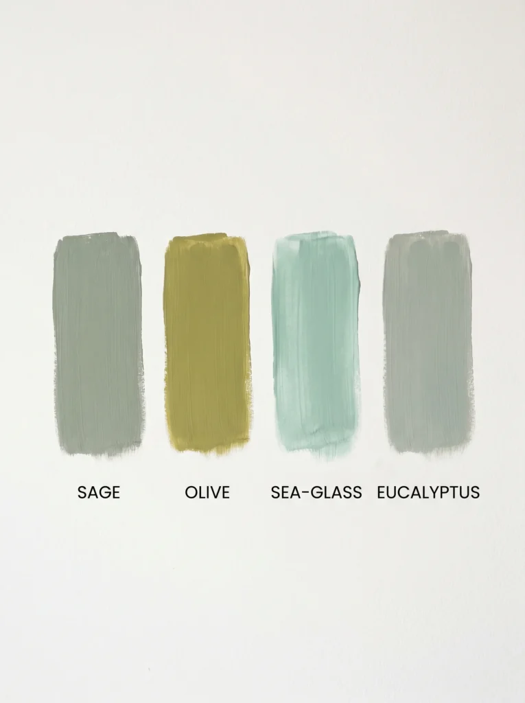
Reading Green Undertones: Sage, Olive, Sea-Glass, and Eucalyptus Side by Side
Earthy green isn’t one color. It’s a family, and each member has a different base color hiding underneath that changes how it behaves in a room.
Sage has a gray base. It’s the safest, most neutral choice and the easiest to live with, which is why it shows up in so many calm bathrooms. Olive has a yellow base. It feels warmer, older, a little more serious, and it pairs beautifully with wood and brass. Sea-glass has a blue base. It’s the coolest of the group and leans coastal, lovely in a bright room but the one most likely to turn chilly in poor light. Eucalyptus sits between sage and sea-glass, a soft gray-green with a faint blue lift that feels clean without going cold.
Match the undertone to the mood you’re after. Want maximum calm and zero risk? Sage. Want warmth and depth? Olive. Want a fresh, airy feel and you’ve got good light? Eucalyptus or sea-glass. Knowing the base color is how you stop guessing and start choosing on purpose.
How Your Bathroom’s Light Direction Decides Which Green Survives
This is the step that wrecks more green bathrooms than any other, and most articles skip it completely. The same paint can look gorgeous in the store and dingy on your wall, and the culprit is almost always the light coming through your window.
North-facing rooms get cool, bluish light all day. That light drains warmth out of color and pushes everything cooler and grayer. Put a blue-based sea-glass green in a north room and it can slide straight into cold and depressing. North-facing bathrooms need warmth fed back in, so reach for olive or a warm sage with yellow in its base. South-facing rooms get bright, warm light for hours, which is the easy mode of bathroom lighting. Most greens look good here, and you can even handle a cooler eucalyptus without it turning gray.
East and west rooms shift through the day. East light is cool and soft by morning, west light turns golden and intense by evening, so your green will look like two different colors depending on when you’re in there. Windowless bathrooms are their own puzzle. With no daylight at all, your bulbs decide everything, and a cool bulb plus a cool green is a recipe for a room that feels like a walk-in fridge. If your bathroom has no window, my guide on the best bathroom color ideas for small windowless spaces walks through which greens hold up under artificial light and which ones collapse.

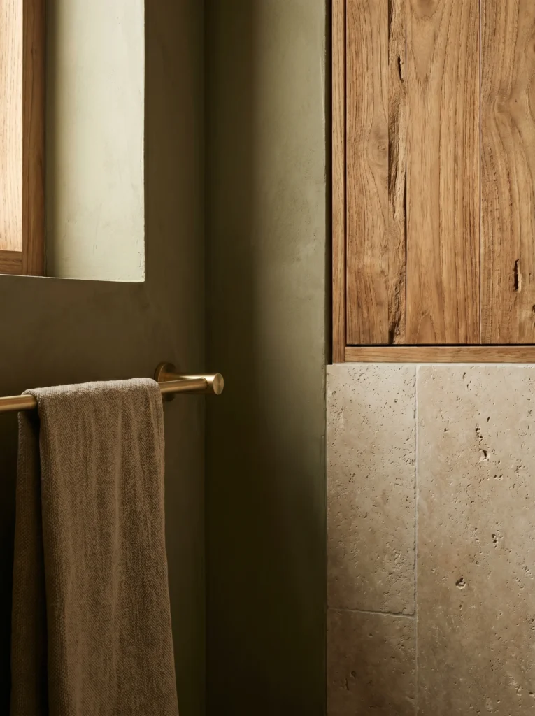
Pairing Green With Stone, Wood, and Matte Metals to Build Earthy Depth
Paint alone gives you a green room. The earthy, layered spa feeling comes from what you put next to the green. Texture is what stops a flat wall from looking like, well, a flat wall.
Wood is the fastest way there. A warm wood, honey oak, teak, walnut, picks up the brown notes hiding inside earthy green and makes the whole room feel grounded. Even a small piece helps. A teak shower mat or stool brings real wood grain into the room at floor level, and a slatted teak bath mat like this Utoplike one doubles as a soft, natural counterpoint to cold tile.
Buy it from Amazon → teak bath mat like this Utoplike one.
Stone adds quiet depth. Honed (matte) marble, travertine, or a tumbled stone tile gives you pattern without shine, and matte is the key word. Glossy, polished surfaces bounce light and read modern and slick, the opposite of spa. Metals follow the same logic. Skip bright chrome and polished nickel. Brushed brass, aged bronze, and matte black all sit calmer and warmer against green. Pick one metal and stick to it across taps, towel bars, and hardware so the eye has nothing to snag on.
Building a Tonal Color Stack Across Walls, Tile, Cabinetry, and Towels
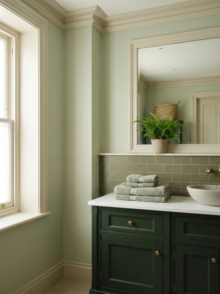
A spa bathroom rarely uses just one green. It uses one green family spread across several surfaces at slightly different depths, and that’s what makes the room feel designed instead of painted.
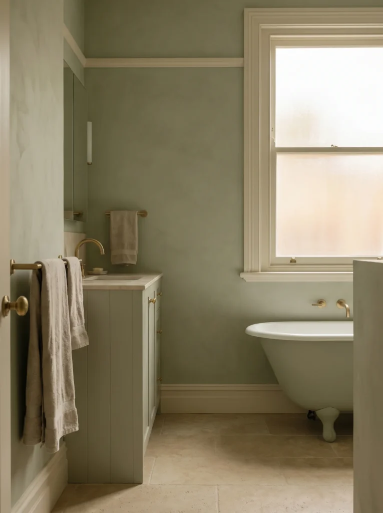
Think of it as a stack from light to dark. Walls go lightest, a soft sage or eucalyptus that keeps the room open. Tile or a vanity can go a step deeper. Cabinetry can go deepest of all, an olive or forest green that anchors the room without darkening it. Because every layer comes from the same family, nothing clashes, but the small shifts in depth give your eye somewhere gentle to travel.
Towels are the easiest layer to play with, and the cheapest place to test a deeper green before you commit to paint or cabinets. A folded stack of sage towels reads as a deliberate part of the palette, not an afterthought. A 6-piece Turkish cotton sage set like COZYART’s gives you that layered, hotel-stack look without repainting anything.
Buy it from Amazon → 6-piece Turkish cotton sage set like COZYART’s.
Keep the rest of the room, ceiling, trim, larger fixtures, in soft whites and warm neutrals so the green stays the star.
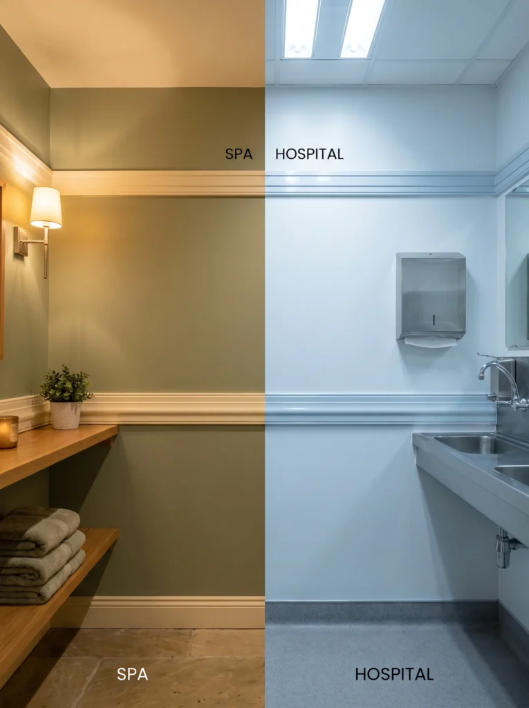
The Mistakes That Turn Spa Green Into Hospital or Swamp Green
A few specific errors take a calm green straight into either “operating room” or “murky pond,” and they’re all easy to avoid once you can name them.
Too much saturation is the first. A green that’s even slightly too bright or pure stops reading as restful and starts feeling synthetic. When in doubt, go grayer and softer than you think you need. The wrong white is the sneakiest mistake. Pair earthy green with a stark, bluish bright white and the green suddenly looks cold and the room looks clinical. Warm, creamy off-whites fix this instantly. Cold lighting undoes good paint just as fast. A bulb in the 5000K daylight range throws blue light that strips the warmth right out of your green, which is how you end up with hospital walls.
Then there’s gloss. High-shine paint and polished surfaces bounce light and harden the whole look, while flat, matte, and eggshell finishes soak light up and keep things soft. The fix for every one of these is the same direction: warmer, softer, more muted. Lean that way and swamp green and hospital green both disappear.
Testing Your Earthy Green Spa Bathroom Color Before You Commit
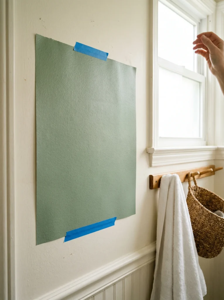
Never buy a gallon off a tiny chip. A color the size of a postage stamp tells you almost nothing about how it’ll feel across a whole wall. Get a large sample on the actual wall first, and the bigger the sample, the more honest it is.
Peel-and-stick samples make this painless because you can move them around and reuse them. A Samplize peel-and-stick sample in a green like Benjamin Moore Amazon Soil uses two coats of real paint and lifts off without damaging the wall, so you can shuffle it from the bright wall to the dark corner in seconds.
Buy it from Amazon → Samplize peel-and-stick sample in a green like Benjamin Moore Amazon Soil.
Once it’s up, watch it through a full day. Check it in morning light, in flat afternoon light, and at night under your bulbs, because a green that looks perfect at noon can turn gray by 8pm. Move the sample to the darkest corner and the spot nearest the window, since one wall is never the whole story. And test it right next to your real towels, tile, and trim, never floating alone on bare drywall. When the green still looks calm in every one of those conditions, your earthy green spa bathroom is ready and you can buy the paint.
Loved this palette? Save the pin to your bathroom inspiration board so you can find these earthy green ideas when you’re ready to start.
Table of Contents
For more bathroom color palettes and design aesthetics to pull inspiration from, see our guide on brown and beige warm neutrals that actually work.