Navy and Gold Bathroom Ideas: A Modern Glam Color Scheme
Most navy and gold bathroom designs go one of two ways. They look custom and calm, or they look like a hotel lobby from 1987. The colors are easy to love on Pinterest. The trouble starts when you try to put them in a real room with real light and real fixtures. What trips people up is rarely the colors themselves. It’s the amount of gold, the finish on that gold, and which surface each color lands on. Get those three right and the room feels expensive. Get them wrong and it feels loud. This article gives you paint direction, finish choices, and a surface-by-surface plan you can take straight to the store.
Why navy and gold read as “glam” instead of just “blue and yellow”

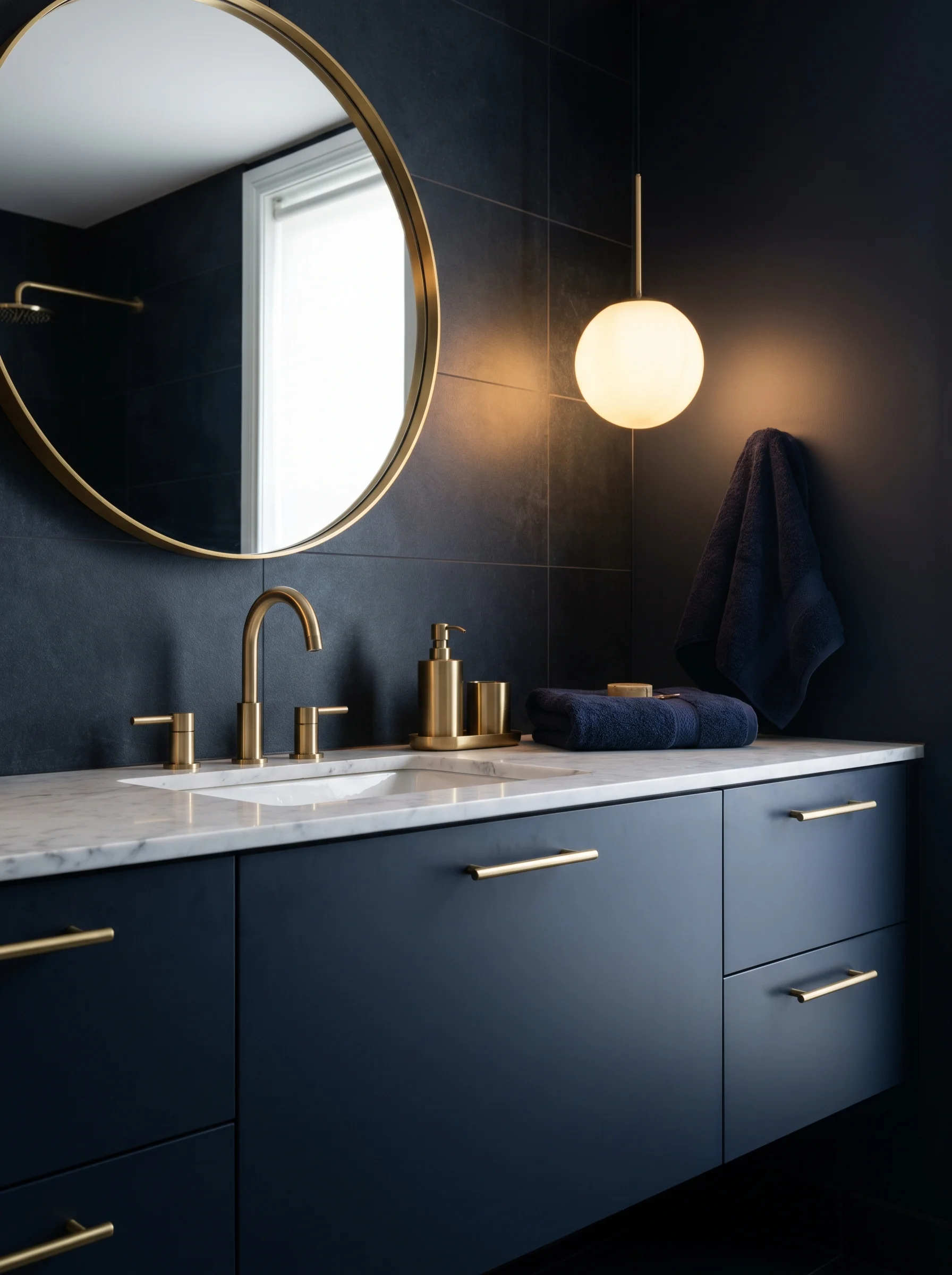
The magic of a navy blue and gold bathroom is contrast. Navy is a cool color that sinks back and feels quiet. Gold is warm and bright, so it steps forward and catches your eye. Your gaze keeps bouncing between the deep base and the shine, and that small back-and-forth is what your brain reads as fancy. It helps that you’ve seen the pair before in places you already think of as rich, like jewelry boxes and evening wear.
Light is the other half of it. Gold against a dark wall copies the way real metal glints in a dim room. The materials carry their weight too. Navy paint with a soft sheen, the veining in marble, and the fine grain of brushed metal each catch light a little differently, so the room looks layered instead of flat. Flat, dead versions of these colors lose the glam in a hurry, which is why your finishes matter as much as your color picks. And the gold has to stay rare. A faucet and a frame against a wall of navy looks sharp. Gold on everything looks like a costume.
The 60-30-10 split that separates modern glam from gaudy casino
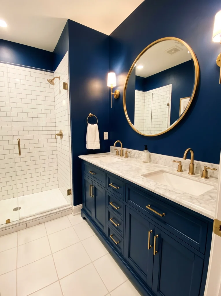
One simple rule rescues more of these rooms than any single paint chip: the 60-30-10 split. Sixty percent of the room is your main color, thirty percent is your second color, and the last ten percent is your accent. Gold lives in that ten percent and rarely climbs higher. The casino look people dread comes straight from breaking this and letting gold spread across every surface.
Here’s how it plays out. Navy can take the big sixty percent on the walls or a large vanity, or it can drop into the thirty range while a white or marble neutral leads. Whatever’s left fills in with white, marble, or a soft gray. Gold shows up last and only on the faucet, the mirror frame, the lighting, and the drawer pulls. That thin slice is what your eye reads as a finishing touch instead of a theme.
Almost every later choice, from your tile to your towels, leans on this split, so settle it before you spend a cent. The whole trick is holding back. Spend less on gold coverage and the room ends up looking like it cost more.
Picking the right navy — why undertone matters more than darkness

How dark your navy is matters less than what’s hiding underneath it. Every navy has a base color buried in the mix. Some lean purple, some lean gray, and some sit closer to a true blue. That hidden base is what decides whether your navy flatters the gold or fights it. A warm-leaning navy with a touch of black or gray usually sits beautifully next to gold, while a cold, purple-heavy navy can clash and turn the whole corner chilly.
So test before you commit. Brush a big sample on the wall, then hold your gold faucet or a pull right up against it. Look at it in daylight and again at night under your own bulbs, because navy can shift a lot between the two. That worry about navy turning the room into a cave is real, but it comes down to light and sheen far more than the color being dark.
A navy in satin or eggshell bounces soft light around and keeps things from feeling heavy. A windowless space can still pull this off with a few adjustments, and our guide to small bathroom color ideas no window walks through them. Shades people often reach for include Hale Navy, Naval, and Hague Blue, though the exact tone changes by brand, so always sample your own before the brush touches the wall.
Brushed, polished, or champagne — matching your gold finish to the look
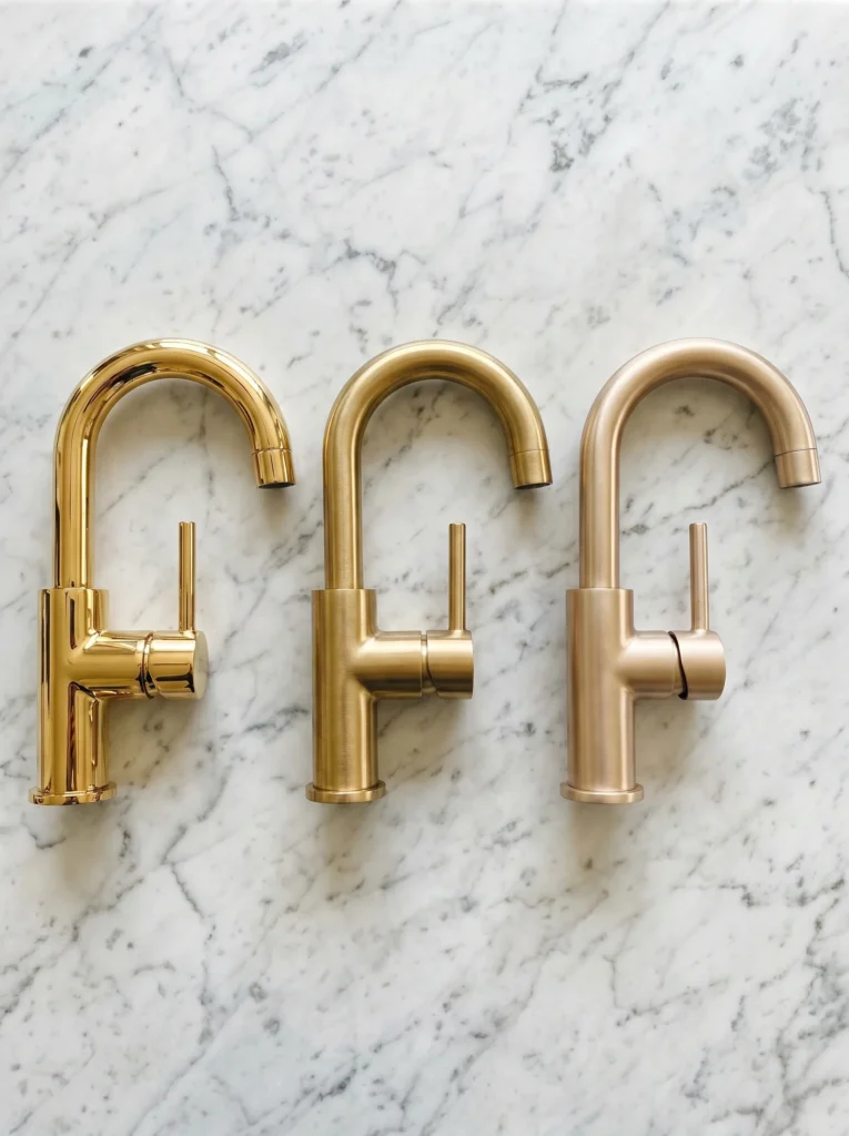
The part most articles skip is that gold isn’t a single finish. Polished gold is shiny and almost mirror-bright. Brushed gold has a soft, low-shine surface with fine lines worked into it. Champagne bronze is a paler, warmer gold that barely raises its voice. Each one changes the mood when it sits against navy.
Polished gold reads bold and a little formal, and it can slide toward that dated brass feeling if the rest of the room is busy. Brushed gold tends to look the most current to most eyes. Champagne bronze feels gentle and suits a calmer, softer space. The biggest slip is mixing two or three gold tones without meaning to, so your faucet, towel bar, mirror frame, and pulls should all share one finish family. Buying everything from a single product line keeps the tones even. Old brass fixtures already in the house almost never match new gold, so it’s worth swapping them rather than hoping they blend in.
Where navy goes vs. where gold goes — a surface-by-surface placement map
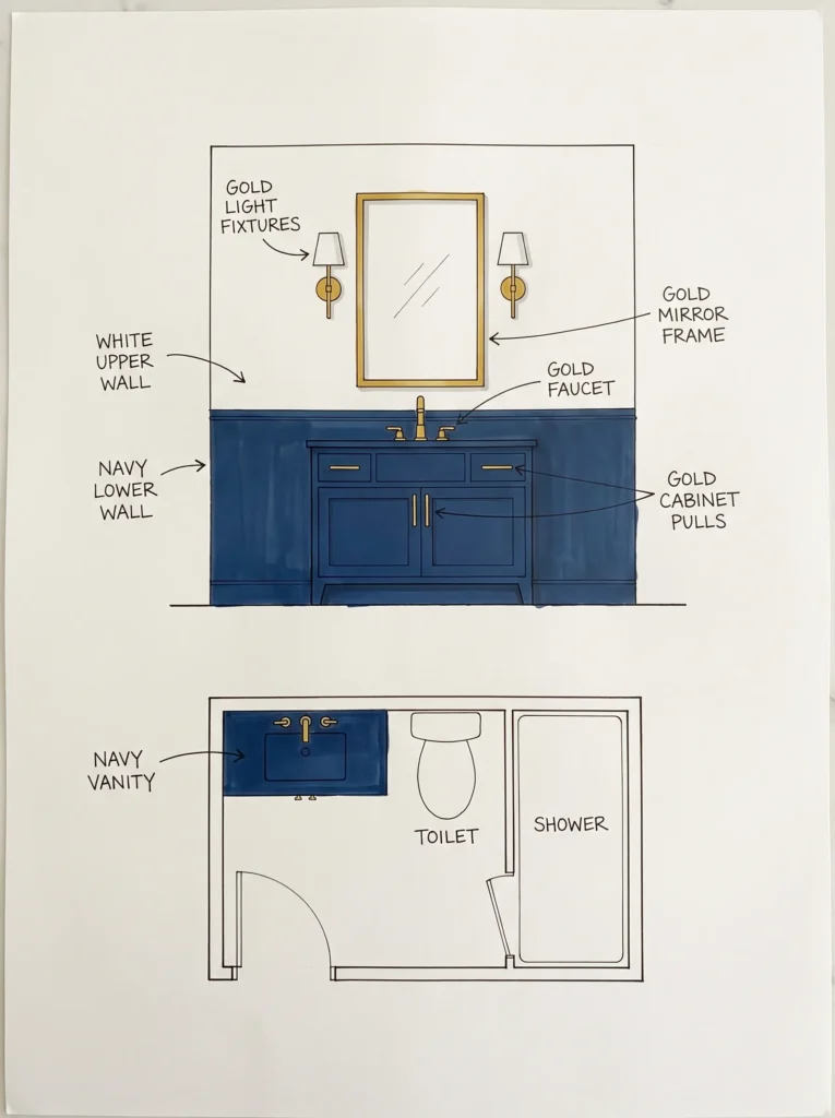
Knowing the two colors is the easy part. Knowing where each one lands is what turns a mood board into a finished room. Navy belongs on the big, grounded surfaces. Put it on the vanity, the lower half of the walls, or a band of tile, and let the heavier color sit low while lighter tones rise up top, so the room never feels heavy overhead. White or marble usually takes the upper walls, the countertop, and the larger tile.
Gold stays on the small, shiny pieces you actually touch. Your faucet, your cabinet pulls, the mirror frame, the towel ring, and the light fixtures are its home. Scatter those touches around the room rather than packing them into one corner, so your eye travels and the shine feels balanced. A round gold-framed mirror over a navy vanity is the classic anchor that ties a navy and gold bathroom color scheme together. Pick warm-toned lighting and the gold glows instead of going dull, and keep the floor neutral so it doesn’t compete for attention.
The neutral that holds it together — why you need white, marble, or warm gray

Navy and gold on their own can feel heavy, and the fix is a third color hardly anyone mentions. A neutral gives your eye somewhere to rest. White, marble, and warm gray handle that job best. Skip it and the room can close in and feel dim, no matter how lovely the navy is on its own.
Marble does double duty, because its veining often carries a soft gray and a warm cream that quietly tie the cool navy to the warm gold within a single surface. White keeps things crisp and bright, while a warm gray softens the whole look and makes it cozy.
Choose a neutral that leans the same temperature as your gold, so a warm gold pairs with a cream-white or a warm gray rather than a stark blue-white. The same balancing move shows up in other palettes, including the breezy mixes in these coastal bathroom decor themes. Give the neutral real square footage instead of a thin sliver, because the breathing room it creates is exactly what lets the navy and gold stand out.
Making navy work in a small or windowless bathroom
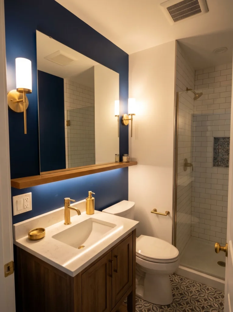
A small, dark room can still go navy if you treat the color as an accent rather than a flood. Coat every wall in deep navy with no daylight and the space starts to feel like a closet. Choose one surface instead. A single navy accent wall, a navy vanity, or navy lower walls gives you the richness without eating all the light.
Light is your strongest tool in a tight room. Warm LED bulbs keep the gold looking like gold and stop the navy from going muddy. A large mirror is the cheapest way to bounce the light you already have, and gold sconces on either side of it throw a soft glow right where you stand at the sink.
Glossier surfaces reflect more than flat ones, so lean toward satin paint and shiny tile when space is short, and keep white grout and pale floors to hold things open underfoot. A floating vanity helps too, since the strip of visible tile beneath it tricks the eye into reading the room as bigger than it is. One bold surface, plenty of light, and bright neutrals around it let a small navy and gold bathroom color scheme feel rich rather than cramped.
Three common navy-and-gold mistakes and the fix for each
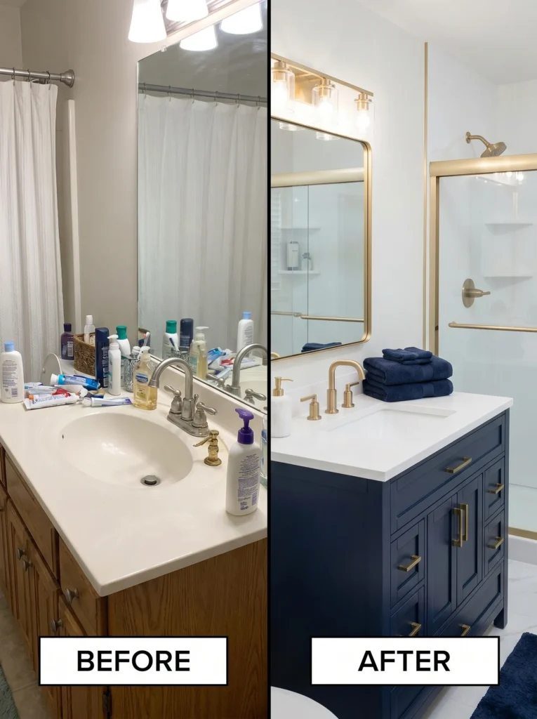
Three mistakes wreck more of these rooms than anything else, and each has a quick fix. Mixed metals top the list. Silver hinges, a chrome showerhead, and gold pulls in the same room read like an accident, so swap the odd pieces until everything shiny shares one gold family, or pick a single spot for a second metal and repeat it on purpose.
Too much gold is the second trap. Gold on the faucet, the frame, the pulls, the towel bar, the trim, and the lights turns glam into glare, so pull it back to a few key pieces and let navy and your neutral carry the room. The wrong navy is the third.
A navy with a cold, purple base can clash with warm gold and look off even when everything else is right, so test your navy against your actual gold and your actual tile before you paint. This kind of careful color matching matters in any themed space, even a playful one like girls bathroom decor for tweens, where the shades still have to agree with each other. Auditing the plan on paper costs nothing. Fixing it on the wall costs plenty.
A sample shopping list to execute the scheme on any budget
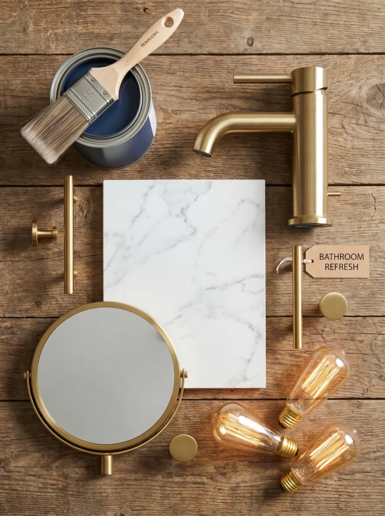
Five things get you most of the way there: navy paint, a gold faucet, gold pulls, a gold-framed mirror, and a neutral surface. Start with the paint, since it sets the base and costs the least to redo if you change your mind. Match all your gold hardware to one finish next, because mismatched metal is the fastest way to make the whole room look cheap.
On a tight budget, paint a single navy accent wall, add gold-friendly hardware and a stick-on gold mirror frame, and let your existing white tile play the neutral. A middle budget swaps in a real brushed gold faucet, fresh cabinet pulls, and a marble-look countertop. A bigger budget adds gold sconces, a custom navy vanity, and true stone surfaces. One statement piece earns its keep more than ten small buys, so put your money on the faucet or the mirror first. Buy the gold pieces together so the tones match out of the box, and layer in the rest over time as you go.
You don’t have to finish all of this in one weekend. Sample the navy before you fall for it, keep gold to the pieces your hand actually reaches for, and give your neutral plenty of room to breathe. Build it that way and you end up with a bathroom that feels custom and calm, with just enough shine to make you slow down on your way past it.
Don’t forget to visit our pinterest profil for more ideas – Bathroomideas
Getting a Navy and Gold Bathroom Right
A navy and gold bathroom reads as rich because you hold back, not because you pile it on. The bathrooms that work put navy on the big surfaces, let a neutral give your eye somewhere to rest, and bring in gold only on the things you actually touch. It all comes back to a few choices: the 60-30-10 split, one gold finish instead of three, checking the undertone before you buy the can, and one bold surface in a small room rather than color everywhere.
The good news is you don’t need a big budget or a free weekend. Paint first, match your metals, and let one piece carry the room. Add the rest when you get to it. Go easy on the gold, give the neutral some breathing space, and live with a navy sample on the wall for a few days before you commit. Do that and the bathroom comes out calm, looking like it cost more than it did.
Table of Contents
For more bathroom color palettes and design aesthetics to pull inspiration from, see our guide on brown and beige warm neutrals that actually work.