How to Create a Modern Black and Gold Bathroom That Looks Expensive
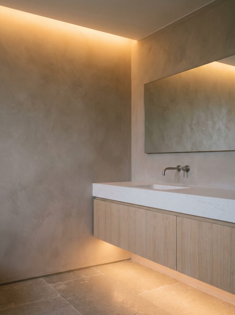
A black and gold bathroom is one of those looks that photographs beautifully and goes wrong in real life. You have seen the version that works: deep matte walls, a warm stone floor, one brass tap catching the light. Odds are you have also built the version that does not.
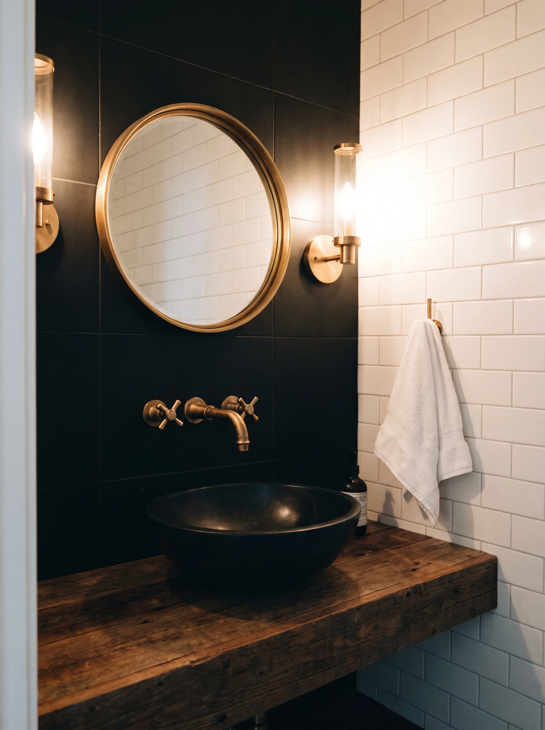
Mine looked like a builder grade bathroom wearing costume jewelry for about six months. Black vanity, gold towel bar, gold faucet, gold mirror frame. Same idea, wrong result. Everything technically correct. Nothing about it expensive. The black and gold bathroom ideas below fix that, starting with how much of each color goes where.
The gap between those two rooms is not money. It is ratio, undertone, and roughly nine small metal parts that nobody ever photographs, and once you notice them you cannot unsee them in your own bathroom.
What follows is the order I would actually do it in. Colors first, then metal, then light, then the unglamorous maintenance stuff that decides whether the room still looks good in year five. Skip around if you want, but the ratio in the first section is the thing every other choice depends on.
This post contains affiliate links. If you buy through them, I earn a small commission at no extra cost to you.
The 70-20-10 Split That Separates a Designer Bathroom From a Rental Flip

Gold is an accent, not a scheme. Most black and gold bathrooms fail because the two colors show up in almost equal amounts, and the eye reads that as a costume instead of a room. Try 70-20-10 instead.
Seventy percent of the room goes to one quiet neutral, so think warm plaster walls, a stone floor, and a plain white tub. Black takes the next twenty, usually the vanity, the mirror frame, and the shower glass. Only ten percent is gold.
That ten percent covers your faucet, handles, towel bar, and mirror trim. Count the gold pieces on one hand and stop. Two colors alone will always look flat, no matter how good your fixtures are.
Add a third neutral and the black instantly looks richer. Everything below hangs off this ratio, so settle it before you open a single shopping tab.
Why Your Black Needs a Brown Undertone (And How to Spot It Against a White Card)
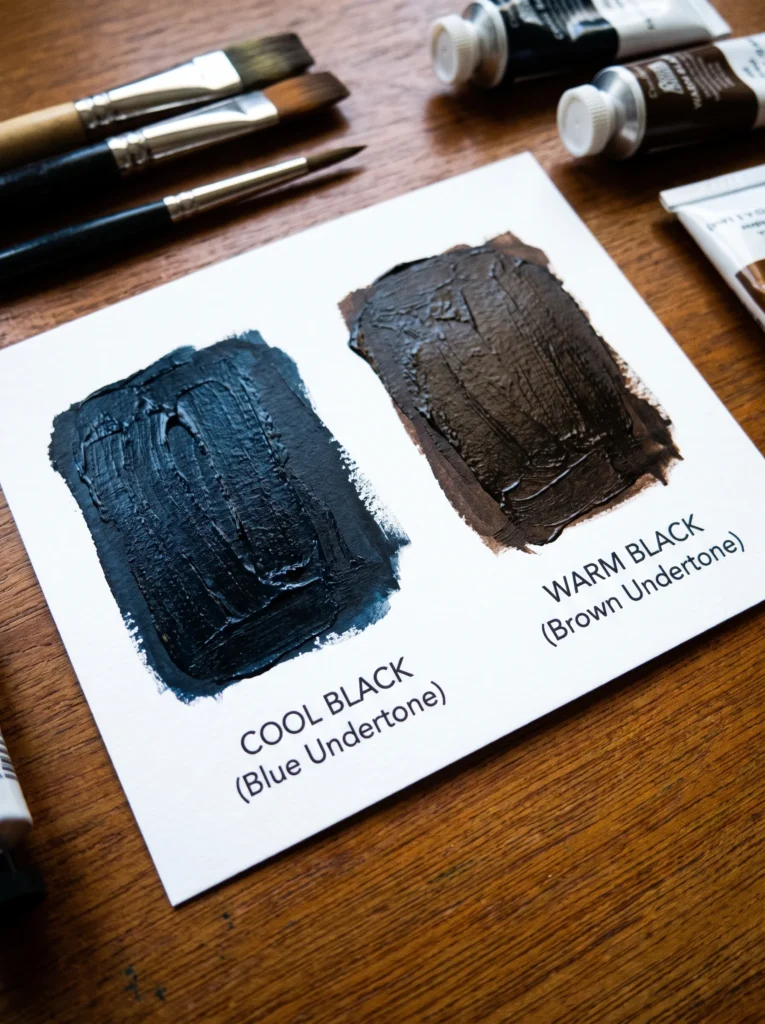
Black is never just black. Most cheap black paint and most budget black tile lean blue, and blue fights brass so badly that the whole room turns gray and muddy under real light. Warm blacks lean brown or green instead. Testing this takes thirty seconds. Hold the sample against a plain sheet of white printer paper in daylight. Cool blacks look slightly purple or slate. Warm ones look like wet soil or espresso.
Do this with everything black you plan to buy, not just paint. Tile, grout, the vanity finish, and the shower frame all need to agree, because one blue-black item next to four brown-blacks will read as a mistake even to people who cannot name why.
Sherwin-Williams Tricorn Black is cool. Iron Ore and Black Fox are warmer and much friendlier to gold. Lock your black first. Gold gets chosen against it, never the other way around.
Brass vs. Brushed Gold vs. Champagne Bronze: Name the Exact Finish Before You Add a Single Thing to Cart
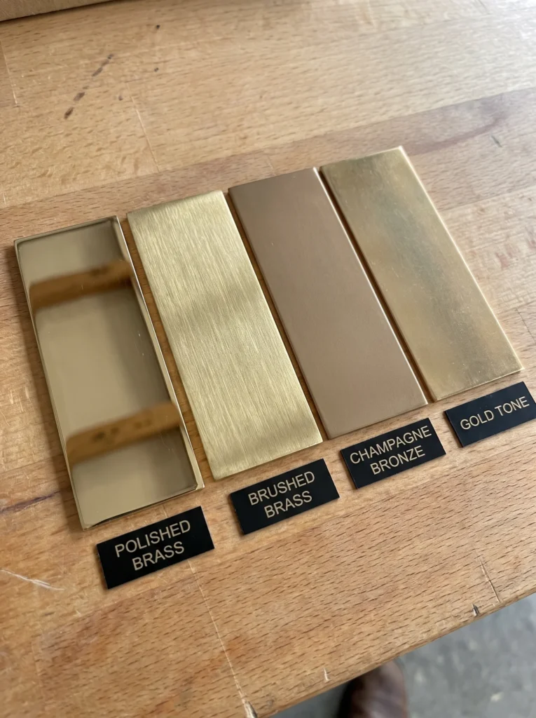
Four different metals are sold as “gold” online, and they look identical on a screen. Polished brass is yellow and shiny. Brushed brass is yellow and soft. Champagne bronze runs pinker and grayer, and unlacquered brass starts bright then darkens over years into something mottled and antique.
Mix two of these and the room reads as an accident. Pick one name and buy every gold item in that exact wording. Screens lie about warmth, so order one small piece first and look at it on your actual counter.
Shop it on Amazon : Brushed Brass Bathroom Faucets
Brands stay consistent within their own line, which is the cheapest shortcut available to you. Buying your faucet, shower set, and cabinet pulls from one manufacturer’s brass family costs nothing extra and removes the single most common reason these bathrooms look off. Delta Champagne Bronze and Moen Brushed Gold do not match each other.
The Third Material That’s Actually Doing the Expensive-Looking Work
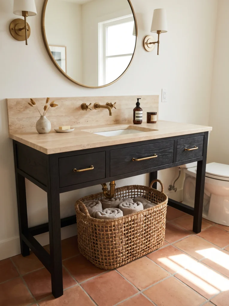
Here is the part nobody mentions on Pinterest. In almost every black and gold bathroom you have saved, the thing making it look costly is neither the black nor the gold. It is the stone, the wood, or the rough plaster sitting quietly in the background.
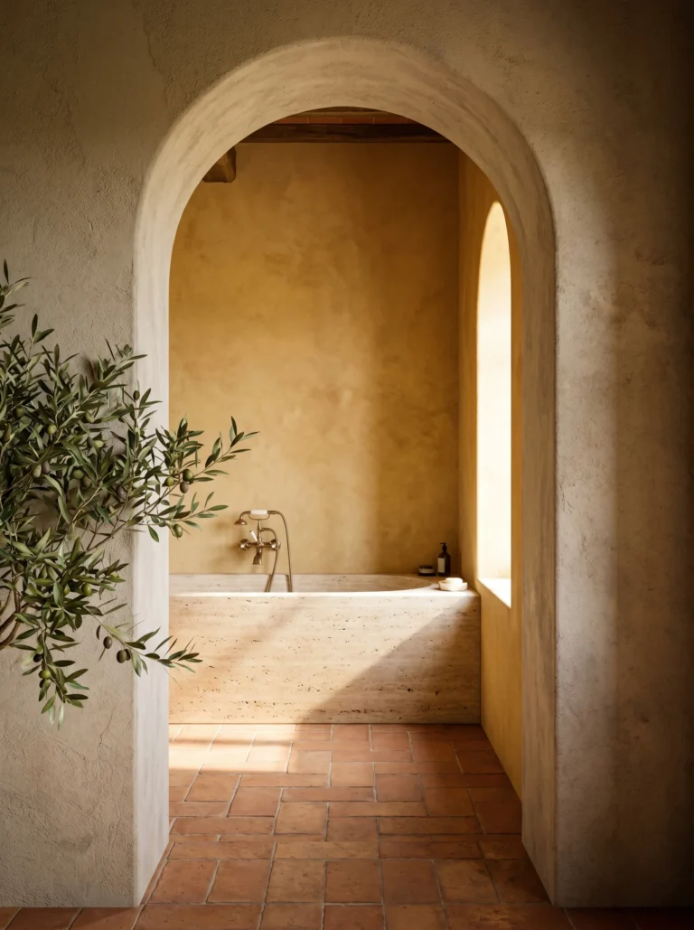
Travertine, honed limestone, white oak, unglazed clay tile, and limewash all do this job. They carry texture, and texture is what your brain reads as real and expensive. A room built from two glossy colors reads as a set.
Pick one and let it run across a big surface. Floor, countertop, or one full wall. Nothing looks more instantly high end than a warm stone floor under a black vanity with a single brass tap above it. Skip this and you can spend two thousand dollars on fixtures and still land somewhere near a hotel chain lobby.
Layering Matte, Honed, and Polished So the Room Doesn’t Read Flat
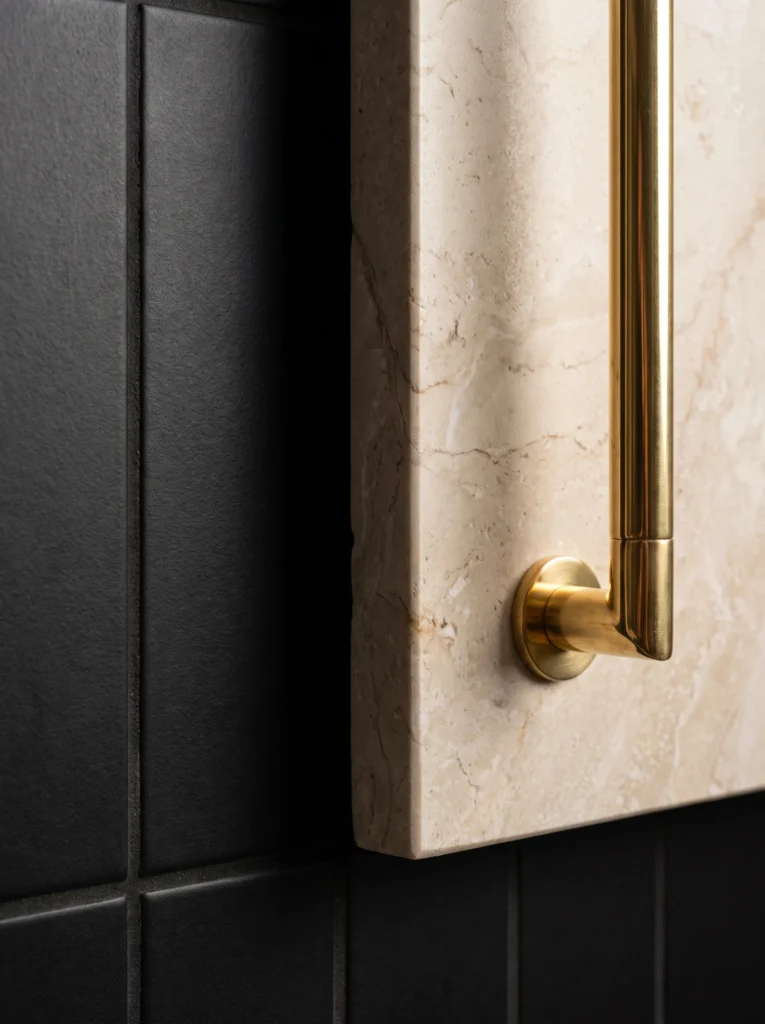
An all matte black bathroom looks like a showroom display, not a home. Sheen is what gives a room depth, and expensive spaces almost always run three levels of it at once. Yours probably runs one. Matte swallows light. Honed absorbs some and returns a soft glow. Polished throws it back at you.
Assign them on purpose. Matte for the biggest surfaces such as walls and floor tile, honed for the counter and the vanity front, polished for the metal and mirror. That contrast is why a matte black wall behind a polished brass sconce looks deep and layered while the same wall behind a matte black sconce just looks like a shadow.
Run your hand across the room in your head. If everything feels the same, add a polished piece.
The Nine Metal Touchpoints That Break the Scheme (Shower Drain, Toilet Lever, Hinges, Outlet Plates…)
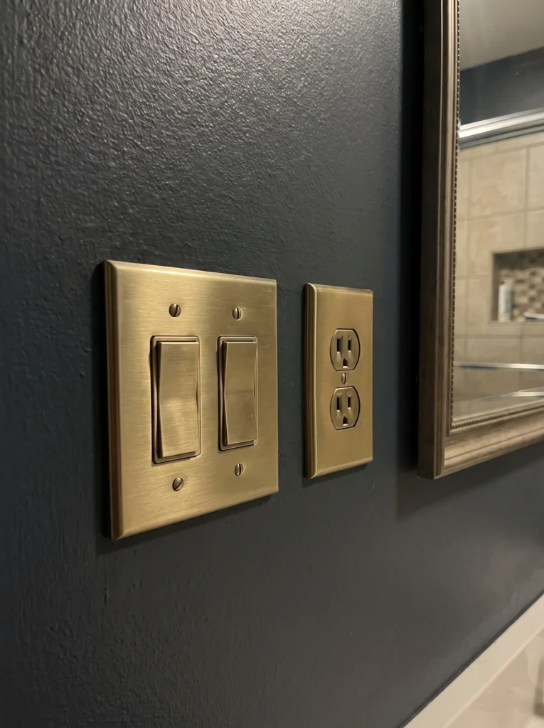
Chrome hiding in plain sight is the number one reason these rooms look unfinished. People buy the faucet and the pulls, then leave nine small silver items scattered around the room. Your eye catches every one.
Walk in and count these: shower drain cover, toilet flush lever, door hinges, door handle, outlet and switch plates, towel hook screws, exhaust fan cover, shower curtain rings, and the little clips holding your mirror. Most cost under twenty dollars each to swap. Some take a screwdriver and four minutes.
Shop it on Amazon : Brushed Brass Outlet and Switch Plate Covers
Fixing five of the nine will change the room more than a new vanity would. Start with whatever sits closest to the mirror, because that is where people stand and look. The exhaust fan cover is the one everybody forgets, and a white plastic grille on a dark ceiling ruins an otherwise perfect room.
Why 4000K Bulbs Make Real Brass Look Like Plastic
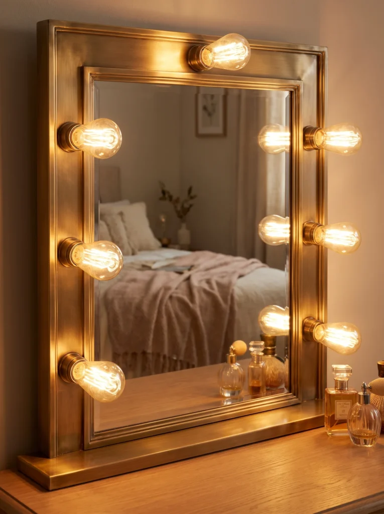
Cool white light drains the yellow right out of brass. Under a 4000K bulb, a solid brass faucet goes pale and slightly green, and it starts to look like the gold plated stuff from a discount bin. Same fixture, different bulb, completely different room.
Go to 2700K. Warm light pushes brass back toward honey and makes brown-based blacks look deep instead of dusty. Check the small print on the box, not the word “soft white,” because that phrase gets used loosely.
Shop it on Amazon : 2700K LED Vanity Bulbs
Buy bulbs with a CRI of 90 or higher while you are at it. High CRI bulbs render color accurately, which is why the same tile can look rich in a showroom and dead at home. This is a twelve dollar fix that changes more than a hundred dollar fixture.
Where to Spend the Money and Where Spray Paint Genuinely Works
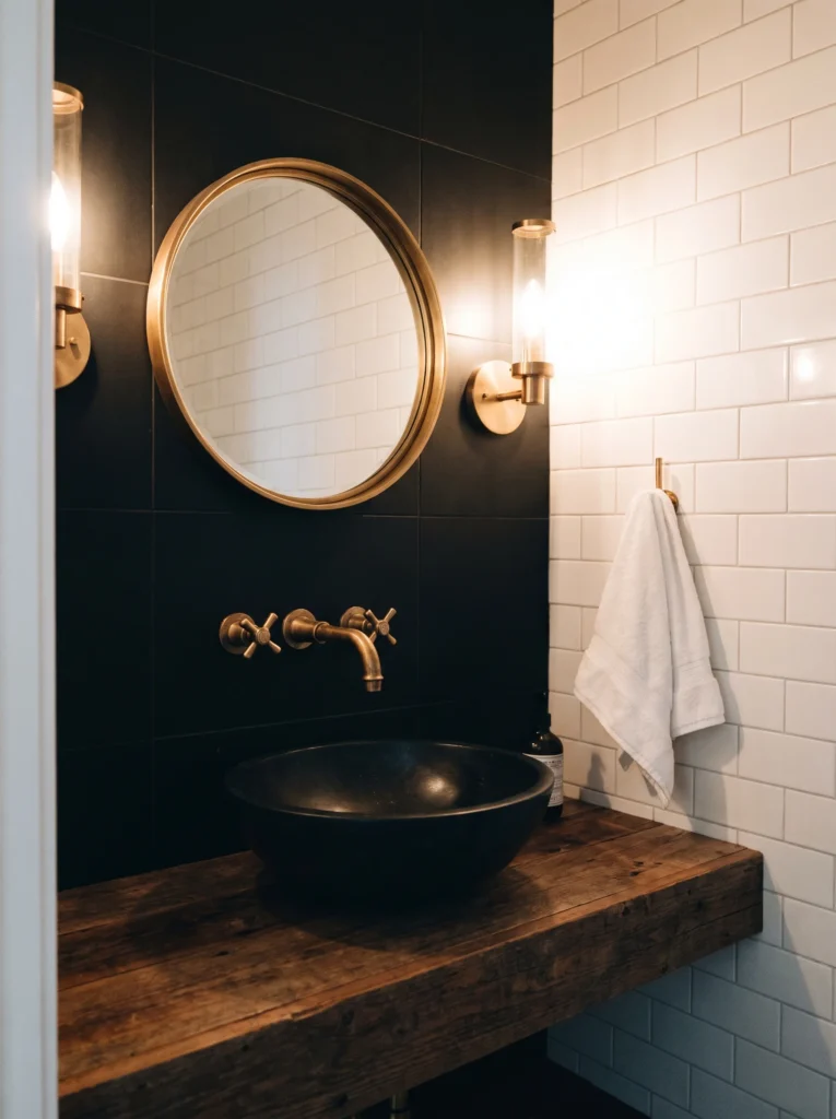
Spend on the vanity wall. That is where every person who walks in looks first, and it holds your faucet, mirror, lighting, and hardware in one frame. Cheap out there and nothing else rescues it. Save on the toilet, the shower interior, and the ceiling. Nobody studies those.
Spray paint works, but only in the right spots. Outlet covers, vent covers, mirror frames, and towel bars hold paint for years because nothing rubs them hard. Faucet handles, shower valves, and door handles will wear through to silver at the contact points within a few months, no matter what the can promises.
Shop it on Amazon : Metallic Spray Paint for Metal Fixtures
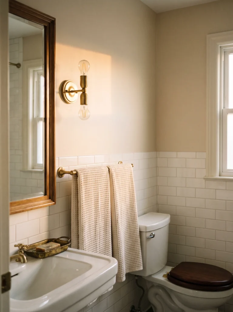
Clean and lightly sand first, then use a bonding primer. If you want more no-renovation tricks in this vein, this guide to giving your bathroom a vintage look for under $200 uses the same logic on a different style.
How Matte Black and Brass Actually Age: Hard Water Spots, Fingerprints, and Wear-Through at the Handle
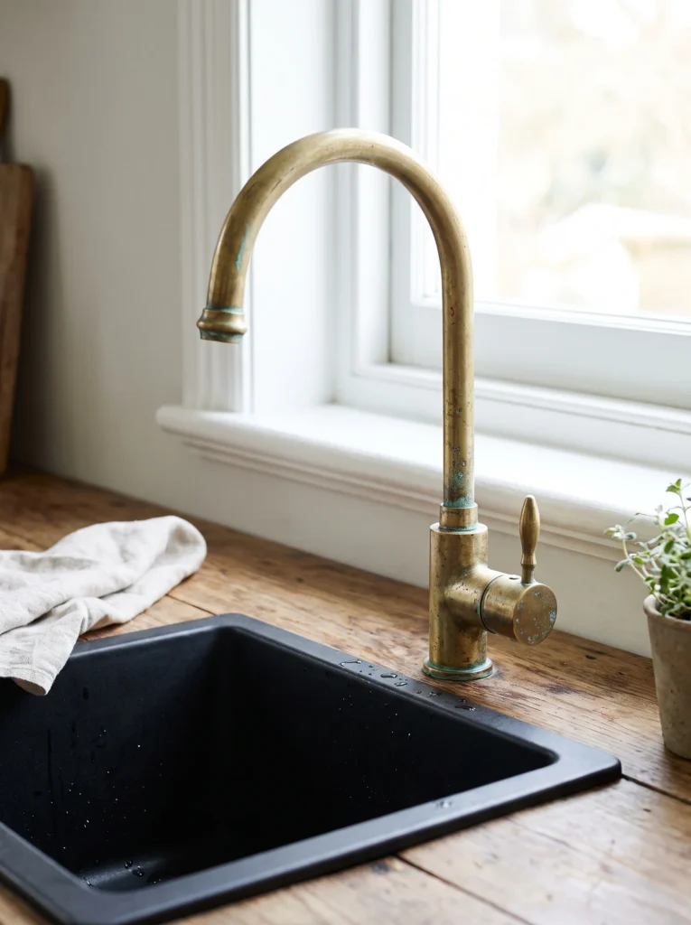
Matte black shows water spots worse than any other finish, and hard water leaves white rings that stand out like chalk. Brass hides them better. Nobody tells you this before you buy.
Look for PVD in the product description. PVD is a bonded coating that resists scratching and wearing through, and it is the difference between a faucet that still looks right in year six and one that shows silver at the handle by month eight. Cheap finishes are sprayed on and they do not survive daily use.
Unlacquered brass is a separate decision. It will darken, spot, and patina, and that is the point of it, but you have to actually want that. Lacquered brass stays bright and needs no polish, though the lacquer can eventually chip.
Shop it on Amazon : Brass Polish and Metal Cleaner
Keep a microfiber cloth in the vanity drawer. Wiping the faucet dry after the sink gets used is the whole maintenance routine.
Keeping a Black and Gold Bathroom Timeless Instead of Dated-to-2021
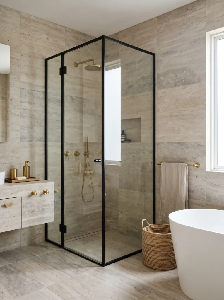
Make the expensive things neutral and the cheap things trendy. Stone floors, white tubs, and simple black frames will still look right in fifteen years. Gold accessories can be unscrewed in an afternoon.
The riskiest choice is a fully gold vanity or gold tile, because those are the pieces you cannot change your mind about. Keep the boldest gold in items that come off with a screwdriver.
If you plan to sell within five years, buyers respond well to black and warm stone and get nervous about heavy metallics. A brass faucet reads as a designer choice. A brass feature wall reads as somebody else’s taste that they now have to pay to remove.
In a black and gold bathroom, build the shell to be quiet and let the ten percent do the talking.
Loved this? Save this pin to your bathroom design board so you have the 70-20-10 rule and the nine touchpoint checklist ready when you start shopping.
Table of Contents
For more bathroom color palettes and design aesthetics to pull inspiration from, see our guide on brown and beige warm neutrals that actually work.