23 Upstairs Bathroom Ideas for Slanted Ceilings and Tight Corners
An upstairs bathroom is usually the room that got whatever space was left over. A roof slope cuts through the ceiling. The floor plan pinches at one end. There’s a dormer sticking out where you wanted a shower, and the only window is the size of a shoebox.
Here’s the thing though. Those weird angles are the reason these rooms can look better than any bathroom on the ground floor. A sloped ceiling gives you something a square box never will, which is shape. The trick is working with the slope instead of pretending it isn’t there.
I pulled together 23 upstairs bathroom ideas below, each one built around a specific attic problem. Low headroom. No window. A knee wall that eats three feet of floor. A footprint so narrow you can touch both walls. Some of these are weekend paint jobs. Others are worth saving for. All of them fit inside a normal house or apartment.
Affiliate disclosure: This post contains affiliate links. If you buy through them I may earn a small commission at no extra cost to you. I only link to things I’d actually use in these rooms.
1. Drench the Whole Slope in Terracotta and Cut the Shower Into the Dormer

Most upstairs bathroom ideas start by painting the slope white and hoping nobody notices it. This room does the opposite. Walls, ceiling, and every awkward angle wear the same warm clay color, so the eye stops hunting for where one plane ends and the next begins.
The shower sits right under the dormer, which means the skylight does the lighting work. Cream square tile lines the wet zone and picks up the sun in a way that keeps the whole corner from feeling closed in. A slim glass panel holds the water back without blocking sightlines.
Brass fixtures warm the clay tone. The floating oak vanity is narrow on purpose, and the arched brass mirror above it repeats the curve of the dormer opening. A trailing plant on the ledge softens the hard paint line.
The checkerboard floor in clay and cream keeps the palette tight. Two colors, used everywhere, is what makes a small room read as designed rather than crowded.
2. Turn the Knee Wall Into a Built-In Vanity Ledge

Every attic bathroom has a knee wall. That short stub of wall where the roof meets the floor is usually where a laundry basket goes to die. Build a counter into it instead.
The cabinetry here is painted the same deep green as the slope above it, which makes the vanity look like it grew out of the architecture. A honed white marble top with a shallow undermount basin sits at ledge height. The wall-mounted brass faucet comes straight out of the green, so nothing eats counter space.
Because the ceiling drops fast here, the mirror is tall and arched and leans into the slope rather than fighting it. Two slim brass picture lights flank it and throw light down onto the counter where you actually need it.
Micro-hex floor tile in warm white with charcoal grout keeps the bottom of the room light. Dark walls, light floor. That balance is what stops a green room from feeling like a cave.
3. Put the Tub Under the Skylight and Let the Sun Do the Rest
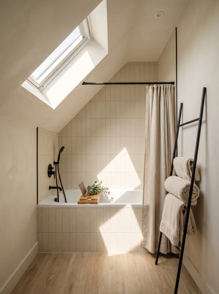
This one uses a standard 60-inch alcove tub, the same one sold at every hardware store. What makes it feel custom is where it sits. Tucked under the lowest part of the slope, with an operable skylight directly overhead.
Warm plaster-white walls wrap the room. The tub surround uses stacked cream tile, vertical on the wall and squared off on the apron, which stretches the space upward. Matte black tub filler and handheld shower give the beige something to push against.
An oatmeal linen curtain hangs from a slim black rod, pushed aside so the tile shows. A teak caddy holds a book and a bundle of eucalyptus. Wide plank wood-look flooring runs underfoot, which is warmer than tile and easier on bare feet.
The black ladder rack in the corner holds rolled towels and takes up almost no floor. Vertical storage in a room this narrow is worth more than another cabinet.
4. No Window? Line the Whole Wall With Mirror
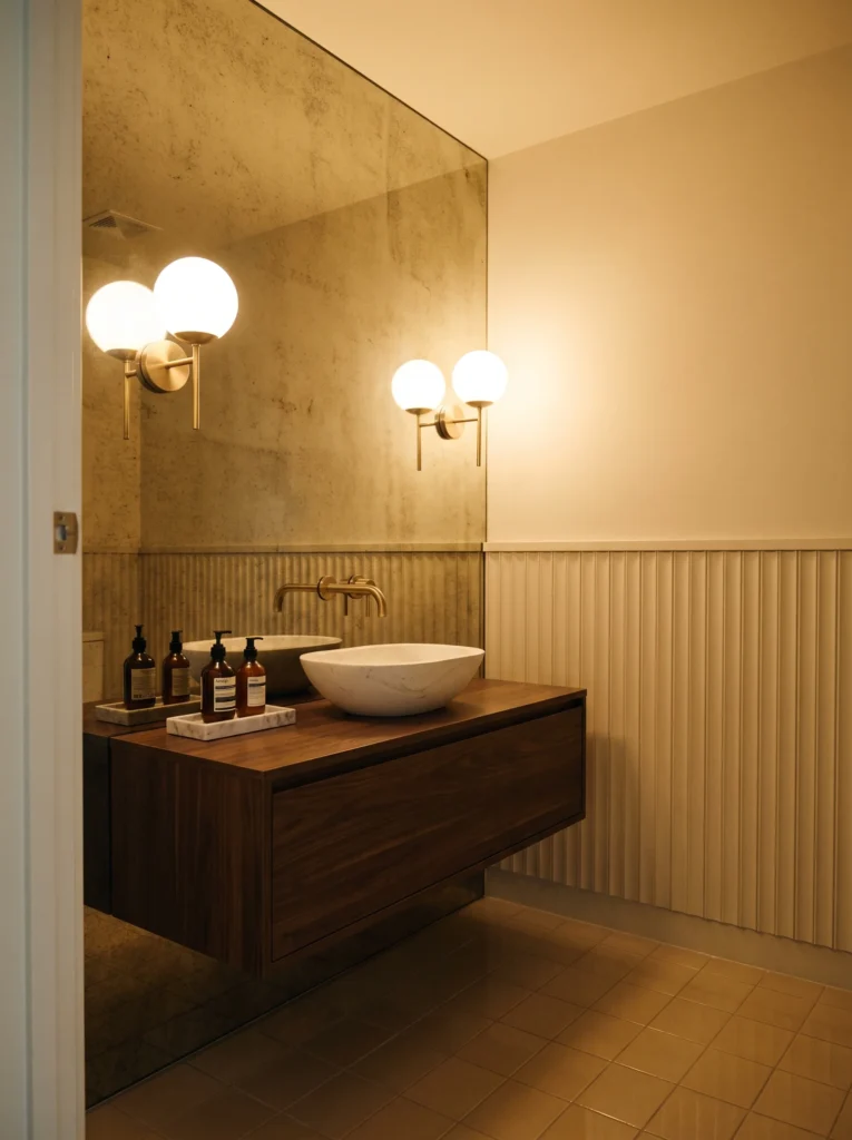
Plenty of upstairs bathrooms sit in the middle of the floor plan with no exterior wall at all. That’s a real problem and mirror is the real fix.
A full antiqued mirror panel covers the wall behind the vanity from counter to ceiling. The speckled aged finish keeps it from feeling like a gym. It doubles the apparent depth of the room and bounces every bit of light twice.
All the light here is artificial and warm. Two brass globe sconces mount directly onto the mirror, so each one reads as two. That’s the whole trick. Warm bulbs around 2700K keep the walnut looking rich instead of orange.
A floating walnut vanity with a sculptural white stone basin keeps the floor visible underneath, which matters when there’s no daylight to open the room up. If you’re working on a similar windowless space, these 17 half bathroom ideas that make a tiny powder room look expensive cover the same lighting problem from a different angle. Fluted cream panelling on the opposite wall adds texture without pattern.
5. Skip the Glass Box and Make the Whole Corner a Wet Room
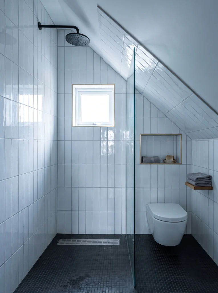
A shower enclosure eats about a foot of floor once you count the tray lip and the door swing. In a room this size, that foot is the difference between usable and not.
Waterproofing the whole corner and running one glass splash panel gets that foot back. Glossy white tile climbs the walls and follows the slope up, which makes the ceiling angle look intentional. A small square window sits right in the middle of the shower wall.
The floor is charcoal micro-mosaic, chosen because tiny tiles let the floor slope gently toward a linear drain without any visible steps. Grip is better too, which matters when the whole room gets wet. A matte black rain head is the one fixture worth spending on here, since it’s the only thing your eye lands on in an all-white shower.
Shop it on Amazon : Matte black rainfall shower system with valve
A wall-hung toilet frees up the floor beneath it and makes mopping easy. Brass-trimmed niche, small oak shelf, folded towels. Nothing else. That restraint is what keeps a wet room feeling calm rather than clinical.
6. Build a Seat Into the Dormer and Wrap Everything in Beadboard
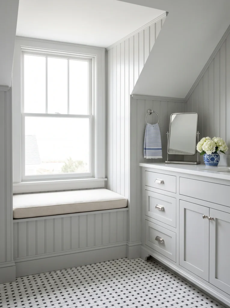
Dormers create a bump-out with a window at the end. Most of them sit empty. This one holds a low cushioned bench in bone linen, with storage underneath the lid.
Every wall wears painted vertical beadboard in a soft dove grey, including the slope. Running one material across the ceiling break makes the roofline read as a deliberate shape instead of an interruption.
The vanity tucks under the low side and matches the wall color exactly. Shaker fronts, polished nickel cup pulls, white quartz counter. A rectangular pivot mirror sits at eye level so the slope above it stays clear.
Black and white basketweave marble mosaic covers the floor. It’s a classic old-house pattern that costs less than large-format marble and hides everything. Hydrangeas in a blue and white jar finish it off without trying hard.
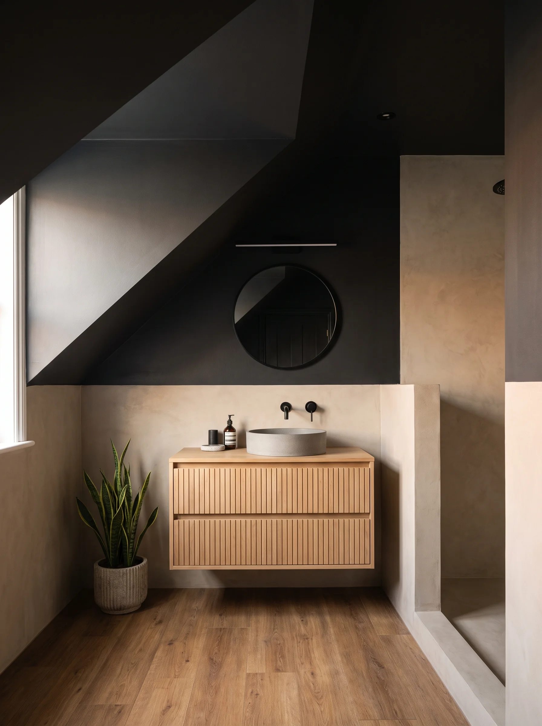
7. Paint the Ceiling Slope Black and Warm It Back Up With Oak
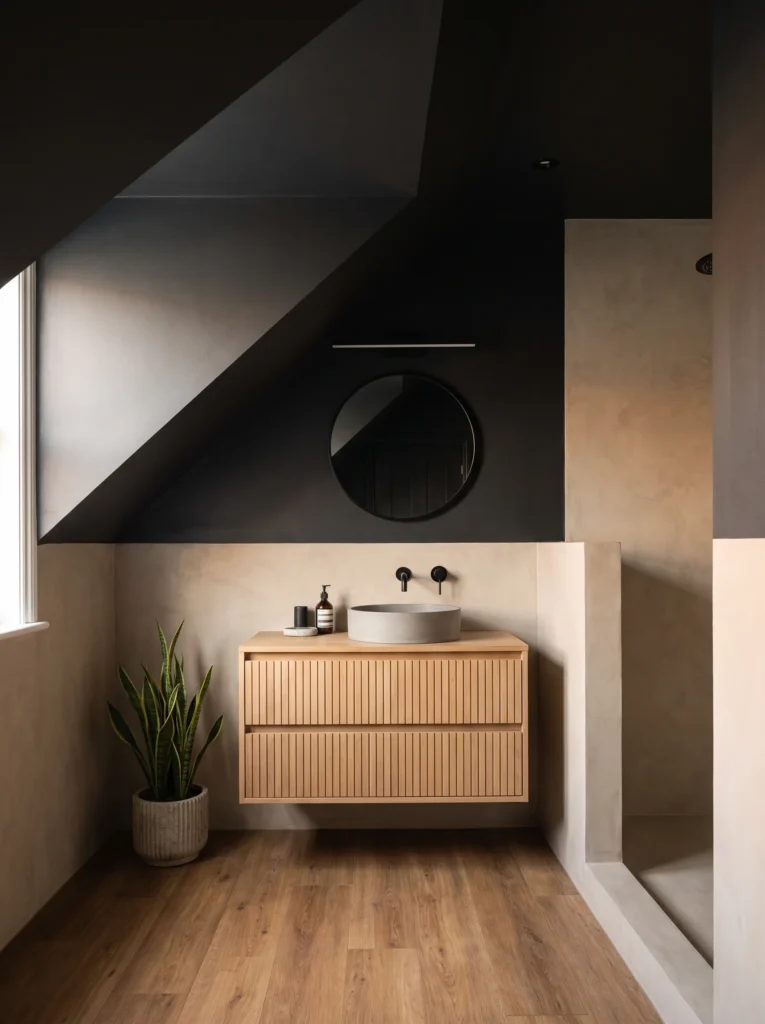
Painting a low ceiling dark sounds like a mistake. It isn’t. Dark surfaces recede, so the slope stops announcing itself and the room reads taller than it measures.
The black stops partway down the wall, and warm oatmeal microcement takes over below. That horizontal break gives your eye a line to rest on. Below it, a light oak vanity with slatted drawer fronts brings the temperature straight back up.
A round black mirror sits centered on the dark wall with a single long linear light above it. Matte black tapware, a concrete-look vessel basin, a snake plant in a ribbed pot. Everything stays low-contrast except the two paint colors.
Warm oak plank flooring underfoot. Cool black above, warm wood below, and the room never tips into feeling cold.
8. Claim the Dead Corner With a Floor-to-Ceiling Storage Tower

There’s almost always one square foot of upstairs bathroom nobody uses. Usually next to the door, usually holding a bin. A narrow tall cupboard fixes that permanently. This one runs floor to ceiling in a soft putty beige, painted the same shade as the surrounding wall so it disappears when closed. Open it and the inside is lined in warm oak with adjustable shelves.
Rolled towels, woven baskets for the things you don’t want on display, amber bottles lined up. The oak interior is the part that makes it feel built rather than bought.
Next to it, a curved-edge vanity in the same putty color with a rounded stone top. Rounded corners genuinely help in a tight room since you stop catching your hip on them. Terracotta and cream checkerboard tile grounds the whole thing.
9. Convert an Old Dresser Into a Vanity and Go Soft Green

This is the cheapest custom vanity you’ll ever get. Find a solid wood dresser at a flea market, seal the top, cut an opening for the basin, and run the plumbing around the back drawers.
The walls are soft sage limewash, which has enough movement in it to look old even on new plaster. Sage sits beautifully against warm wood and terracotta, and it hides the slope’s shadow line instead of highlighting it.
An ornate gilt oval mirror hangs on the slope. Two brass candle-style sconces flank it. A framed fern print leans on a small ledge. None of it matches exactly and that’s the point. The faucet is where the money goes in a build like this, because an antique brass bridge tap is what sells the whole vintage story on a dresser that cost forty dollars.
Shop it on Amazon : Antique brass wall-mount bridge bathroom faucet
Terracotta hexagon tile on the floor with a faded vintage runner over it. The runner is the detail that makes the room feel lived in rather than staged.
10. Where the Ceiling Gets Too Low to Stand, Add a Bench
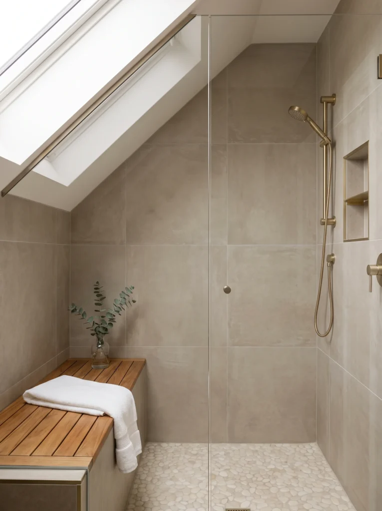
At the low end of a slope there’s a wedge of space you can’t stand up in. Instead of walling it off, run a bench across it.
The bench here is slatted teak, full width, sitting at normal seat height. Teak handles constant water without sealing and warms up fast, which is why it’s used on boats.
Walls are large-format greige tile, which cuts down on grout lines and makes a small shower feel bigger. A skylight sits directly above the low end, so the darkest part of the room ends up the brightest.
Brushed brass handheld on a slide bar means you can sit and shower, which is genuinely useful and also good future planning. Cream pebble floor tile, a recessed niche with a brass shelf, one sprig of eucalyptus. Done.
11. Powder Blue Walls With a Scalloped Tile Half-Wall

Scalloped tile is having a moment and it works especially well under a slope because the curved top edge softens all those straight angles.
Glossy white fish-scale tile runs about half height and stops with the scallop shape exposed, no trim piece needed. Above it, soft powder blue paint carries up the wall and across the ceiling slope.
The vanity is white with fluted drawer fronts, which repeats the vertical rhythm of the tile below. Sink is a simple integrated ceramic top, the kind you can buy off the shelf.
A brass arched mirror with a scalloped edge hangs beside a single brass globe sconce. Warm white floor tile keeps the base neutral. It’s a cheerful room without being childish, which is a hard line to walk.
12. Wallpaper the Slope, Ceiling and All

Stopping wallpaper at the ceiling line draws a big obvious line across your room. Running it right over the slope does the opposite. The pattern absorbs the angle.
This botanical print in ochre, sage, and charcoal on a cream ground has a hand-drawn look, so small imperfections around the slope don’t show. Peel-and-stick versions work here if you’re renting, though a bathroom needs decent ventilation either way.
Against all that pattern, the vanity goes plain and dark. Black shaker fronts, white quartz top, brass gooseneck tap. A round black mirror and a black picture light sit against the busiest part of the wall.
The skylight cut into the papered slope brings in enough daylight to keep the pattern from feeling heavy. Terracotta grid floor tile picks up the ochre in the print.
13. One Statement Floor Tile Is Sometimes the Whole Design

When the room is barely wider than the door, spend your budget on the floor and keep everything else quiet. Bold black and cream encaustic-look tile runs wall to wall here. The pattern is big relative to the room, which sounds wrong but actually works. Small patterns in small rooms just look busy.
Walls stay warm chalk white. The vanity is a compact wall-hung unit with a slim oak drawer pull, floating so you can see floor underneath and the room reads deeper. A floating unit is the single best furniture decision in a narrow bathroom, and it’s worth buying a good one since it carries the whole room.
Shop it on Amazon : Wall-mounted floating bathroom vanity with sink
An oversized frameless round mirror nearly touches the slope. Matte black tap and towel ring. One olive branch in a glass vase. That’s genuinely everything in the room, and it’s enough.
14. Hide a Stacked Washer and Dryer Under the Slope

Laundry upstairs makes sense. That’s where the clothes are. The slope creates a niche that’s exactly the right depth for a stacked machine. Flanking cabinet doors in warm greige close over the machines and match the vanity across the room, so the whole wall reads as one built-in run. Bar pulls in matte black tie it together.
An oak folding ledge sits at counter height under the low window, with a big woven basket underneath. That ledge is the part people forget and then miss every single day.
The vanity opposite is compact with a round black mirror above it. Warm cream floor tile throughout. Check your floor structure and drainage before committing to this one, since machines are heavy and vibrate.
15. A Long Trough Sink Solves the Shared Kids’ Bathroom
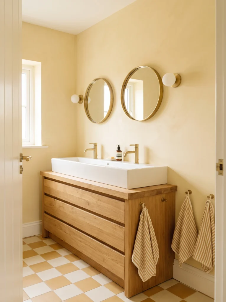
Two sinks won’t fit in most upstairs bathrooms. One long trough basin with two taps will, and it takes up the same wall as a single vanity.
The basin here sits on a solid oak cabinet with deep drawers, so there’s room for towels and everything else kids leave everywhere. Brass taps, two of them, spaced far enough apart to avoid elbow fights. Walls are soft butter yellow limewash, which is warmer and less expected than the usual pale blue. Two round brass mirrors hang side by side with small globe sconces between and beside them.
Low brass hooks hold striped towels within kid reach, which is the real design decision in this room. Honey and cream checkerboard floor tile takes a beating and still looks good.
16. Run a Hidden Light Strip Along the Base of the Slope
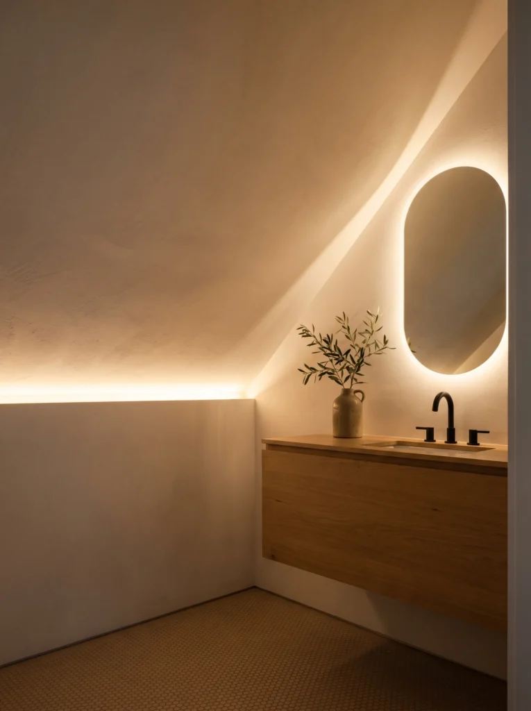
This is the single best lighting trick for a sloped ceiling and almost nobody does it.
A recessed LED strip runs along the line where the slope meets the wall, aimed upward. The light washes across the plaster and the angle softens into a gradient instead of a hard crease. Warm white, around 2700K, keeps it flattering.
There’s no overhead fixture at all in this room. The cove strip plus a backlit oval mirror is the whole scheme, which works because you never get a downlight glaring off the sloped surface. A backlit anti-fog mirror is doing double duty here as both light source and mirror, so it’s worth getting a decent one.
Shop it on Amazon : LED backlit oval bathroom mirror with anti-fog
A floating oak vanity, matte black tap, one olive branch in a stoneware jug. Warm hexagon floor tile below. In the evening this room glows, and that’s worth more than any tile choice.
17. Stagger Open Shelves Into the Angle Above the Toilet
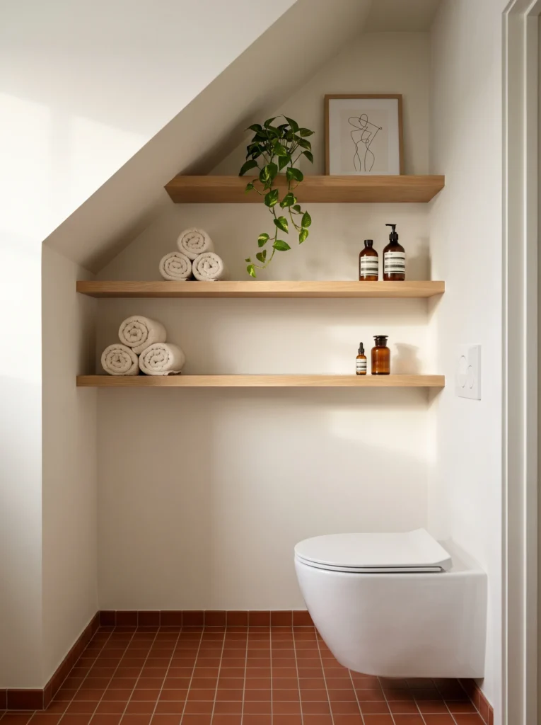
The wall above a toilet is dead space everywhere. Under a slope it’s dead space that also happens to be shaped like a triangle. Three oak floating shelves solve it. Each one is cut shorter than the last so the ends follow the ceiling line, which turns a fiddly angle into a clean staircase shape.
Styling stays loose. Rolled cream towels on the lower shelves, a trailing pothos spilling off the top, amber apothecary bottles, one framed line drawing propped at the back.
The toilet is wall-hung with a concealed cistern, which keeps the floor clear and lets the shelves start lower. Warm chalk walls, terracotta grid floor tile. Cheap to build, and it holds a surprising amount.
18. Curve the Shower Glass to Soften a Tight Right Angle

A square shower in a square corner leaves two sharp edges sticking into a room that has no space to spare. A curved enclosure takes those corners off.
The glass here sweeps in a quarter circle with brass hinges and clamps. Cream stacked tile runs vertically up the walls and continues outside the enclosure, so the shower doesn’t look bolted on. Same tile everywhere, same floor tile inside and out.
That continuity is what makes a small bathroom read as one space rather than two. Across from it, a compact walnut wall-hung vanity with an arched brass mirror and a single globe sconce. The warm wood keeps all that cream from going flat. A window at the far end does the rest.
19. Swap the Swing Door for a Pocket Door and Panel Everything

A standard door swing needs about nine square feet of clear floor. In a narrow upstairs bathroom, that’s often the entire usable area. A pocket door slides into the wall and gives all of it back. This one is flush and painted to match, so it disappears when open.
Walls and slope are clad in painted vertical tongue and groove in a soft mushroom taupe. Running the boards up over the ceiling angle unifies the shape, and the shadow lines between boards add texture without pattern.
The vanity is slim, wall-hung, painted the same taupe with a white stone top and a brass wall-mounted tap. Warm oak-look flooring runs through. A small fern is the only decoration and it’s all the room needs.
20. Cut the Skylight Directly Above the Vanity

Where you put a skylight matters as much as whether you have one. Directly over the vanity gives you clean, shadow-free light on your face, which no wall fixture really matches. The vanity here is floating oak with a chunky cream stone top and an integrated basin carved into it. Wall-mounted matte black tap, so nothing crowds the stone.
A frameless round mirror hangs just below the skylight opening. It catches the daylight and throws it back into the room, which is why frameless works better than a heavy frame in this spot.
Warm white walls, warm hexagon floor tile, a pothos trailing off a small oak ledge. The room is almost empty and it doesn’t feel bare, because the light is doing the decorating.
21. Use a Full Linen Curtain Instead of a Glass Screen
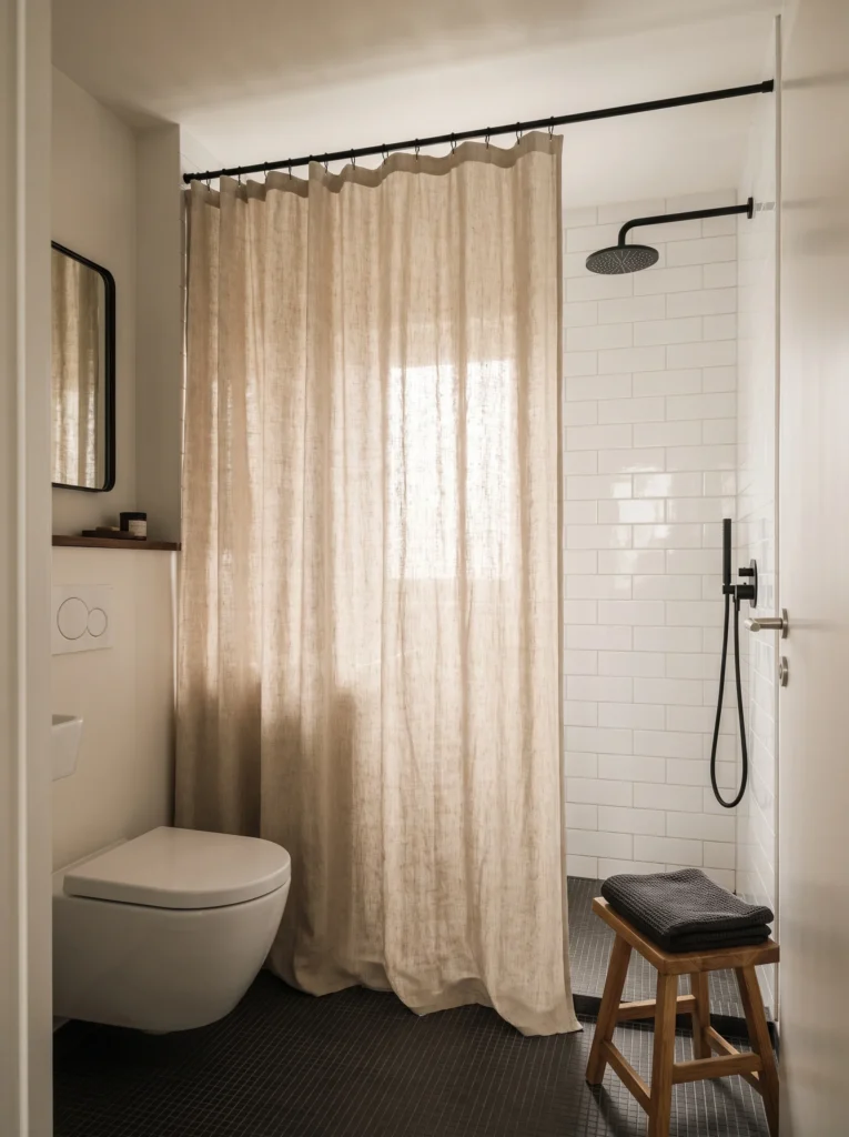
Glass screens are expensive, heavy, and show every water spot. A generous linen curtain costs a fraction and softens the whole room. The key is length and fullness. This curtain runs floor to ceiling on a slim black rail with plenty of extra width, so it hangs in real folds instead of stretching flat like a shower liner.
Use a waterproof liner behind it. Real linen is what makes this work, and it’s the difference between a curtain that looks like drapery and one that looks like a shower liner.
Shop it on Amazon : Natural linen shower curtain, extra long
Behind the curtain, glossy white subway tile and a matte black rain head with a handheld. Charcoal micro-mosaic on the floor. A wall-hung toilet, a small black-framed mirror on a floating walnut ledge, and an oak stool holding folded grey towels.
22. Carve Storage Into the Wall Instead of Adding Cabinets
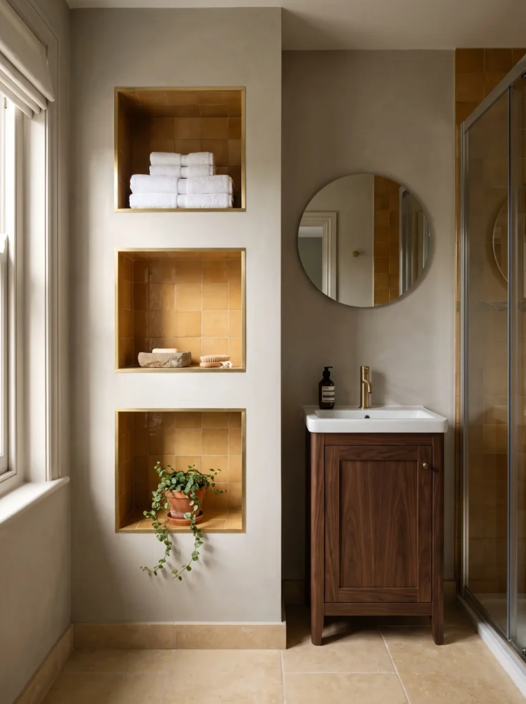
Standard stud walls are about three and a half inches deep. That’s enough for towels, bottles, and a small plant, and it costs you no floor at all.
Three niches stack vertically here between studs. Each one is lined in glossy ochre-toned tile and trimmed in brass, which turns storage into the feature wall.
The tile inside is the whole idea. A plain painted niche looks like a hole. A tiled and trimmed one looks deliberate, and the warm color inside glows against the neutral plaster.
Across the room, a small walnut vanity with a round mirror and a brass tap. Travertine-look floor tile in warm cream. Check for pipes and wiring before you cut, and keep niches out of exterior walls where insulation lives.
23. Split the Wall in Two Colors Right Along the Slope Line
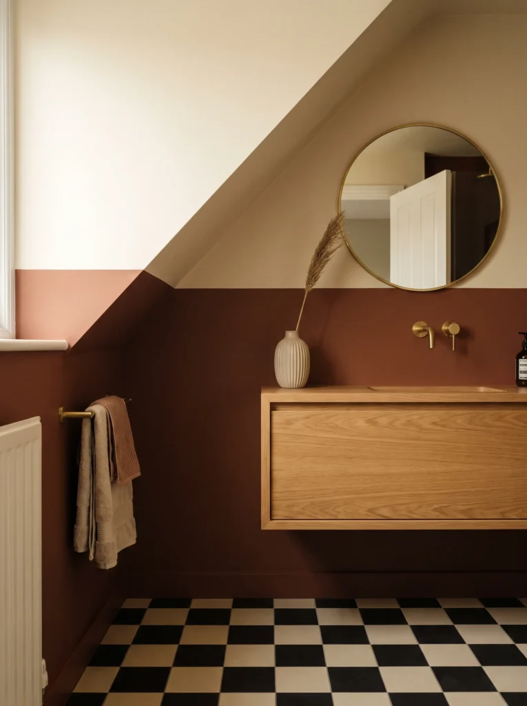
The last idea is also the cheapest, and it’s the one I’d try first. Paint the room in two colors and put the dividing line exactly where the slope hits the wall.
Cream above, deep clay brown below, with a soft pink band picking up along the low window wall. Suddenly the angle looks like a design decision instead of a construction accident.
Everything else stays simple. A long oak floating vanity with an integrated basin, brass wall-mounted taps, a round brass mirror centered above it. A brass towel rail on the side wall.
Black, cream, and tan checkerboard tile covers the floor and pulls both wall colors together. Use painter’s tape and a level, take your time on the diagonal, and this is a Saturday.
Three Things That Make Any Sloped Bathroom Work
Beyond individual ideas, a few rules keep showing up across all 23 rooms.
Carry one material over the break. Paint, tile, panelling, wallpaper. Whatever you use, run it from wall to ceiling without stopping at the angle. The moment you change materials at the slope line, the ceiling looks lower.
Put the tall stuff at the tall end. Shower, mirror, storage tower. Anything you stand next to belongs where headroom is full. Benches, tubs, and low cabinets go under the slope.
Light from below the slope, not through it. Sconces, cove strips, and backlit mirrors work better than downlights, which glare off angled surfaces and cast strange shadows on your face.
What to Do Before You Start
Measure your headroom at the shower position first. You want at least 6 feet 8 inches where you’ll stand, and building codes in most areas have something to say about this.
Check ventilation next. Attic bathrooms trap moisture faster than ground floor ones because warm air rises and gets stuck under the roof. A properly sized extractor fan vented outside is not optional here.
Then think about your floor. If you’re adding a tub, a wet room, or a washing machine, get someone to confirm the joists can handle it before you buy anything.
Bringing It Together
The upstairs bathroom is almost never the room with the best proportions in a house. It’s the one that got squeezed between a roofline and a stairwell, and that’s exactly why it can end up being the most interesting.
Pick one move to start with. Paint the slope. Build a bench. Cut three niches into a stud wall. Any single change from this list will shift how the whole room reads, and none of them require you to move a wall.
The awkward angle isn’t the problem. Treating it like one is.
Loved these upstairs bathroom ideas? Save this pin to your bathroom board so you can find it when you’re ready to start, and follow along for more small-space design breakdowns.
Navigation Upstairs Bathroom Ideas
For more help choosing materials, fixtures, and layouts that fit your bathroom’s real constraints, see our guide on fitting a tub and separate shower into a small bathroom.