24 Bathroom Color Schemes That Actually Work in Real Light
Pick the scheme around three things you cannot repaint: the tile, the countertop, and the bulb in your vanity light. Choose a bathroom color palette that already agrees with those, keep it to two or three colors, and put the boldest one on the vanity rather than the walls. The caveat: every color below shifts under a different bulb, so test before you commit to a gallon.
Almost all the bathroom color schemes online were photographed in a studio, in daylight, in a room with nothing fixed in it. Your bathroom has grey marble on the floor, a cream countertop you are not replacing, and one warm bulb over the mirror. That gap is why palettes that look perfect on screen turn muddy on your wall.
The 24 bathroom color schemes below are ordered from the safest to the boldest, and each one names the condition it needs. Some want daylight. Some only work in a windowless powder room. A few depend entirely on what your floor is already doing, which is the part most guides skip completely.
You will also find the three checks that decide whether any of them work: the fixed elements, the light, and the finish. Those three run underneath every scheme on the list, and none of them is a matter of taste. Get them right and the colour itself becomes the easy part.
This post contains affiliate links. If you buy through them, I may earn a small commission at no extra cost to you.
Table of Contents
Warm white with pale wood is the scheme that never fights the light

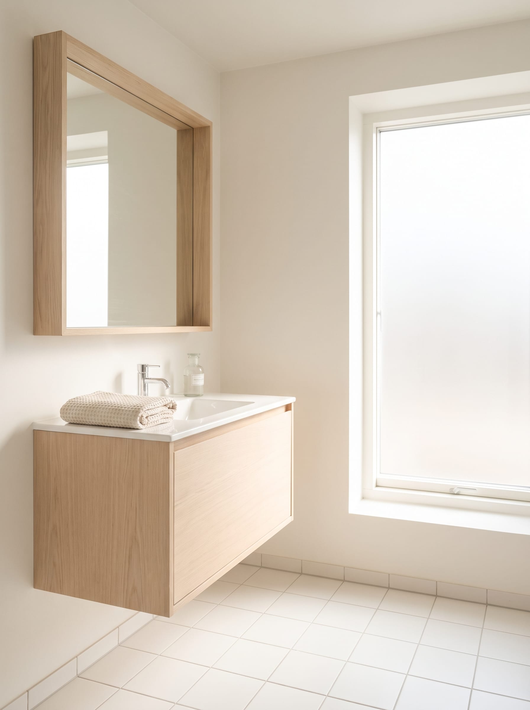
Start here if your bathroom has one small window and you want it to feel bigger without going stark. Warm white reflects almost as much light as brilliant white but carries a trace of yellow, which stops the room reading like a clinic on a grey afternoon.
The wood is doing the real work in this pairing. A pale oak or ash vanity adds enough warmth that the white never turns blue on a dull day, and because the grain is fine it reads as texture rather than as a second colour competing for attention. Keep the floor pale too, or the balance tips.
Sage and off-white sit next to each other on the color wheel
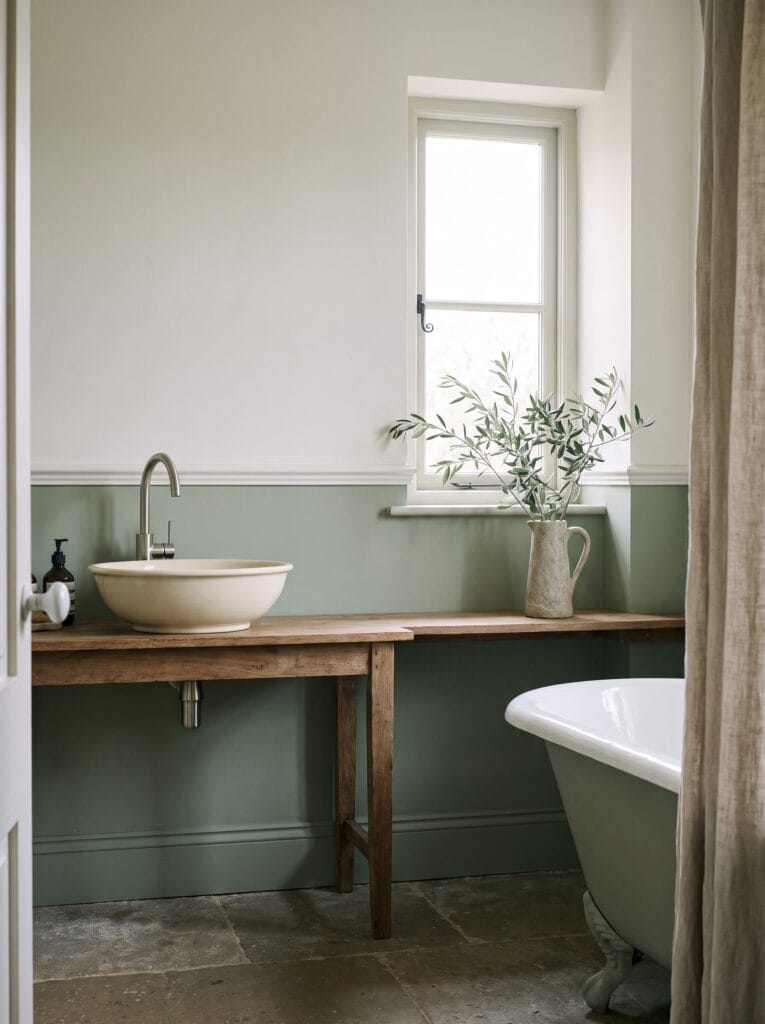
Neighbouring colors never clash, which is the whole reason this pairing is so forgiving. Sage and a warm off-white sit close together in hue, so the transition between them reads as one soft gradient rather than as two decisions stuck side by side.
Analogous colors like these give you contrast without tension, and that makes them ideal for a room you want to feel calm in. Keep the green below eye level and the lighter tone above, because the reverse makes a ceiling feel like it is pressing down.
A colour wheel is genuinely useful here rather than decorative. Holding one up tells you in seconds whether two paint chips are neighbours, opposites, or just slightly wrong, which is far quicker than taping a dozen swatches to a wall and guessing at the relationship between them.
Shop it on Amazon : Color Mixing Guides Color Wheel, 9-1/4 Inch
Navy with brass against white is the highest-contrast classic
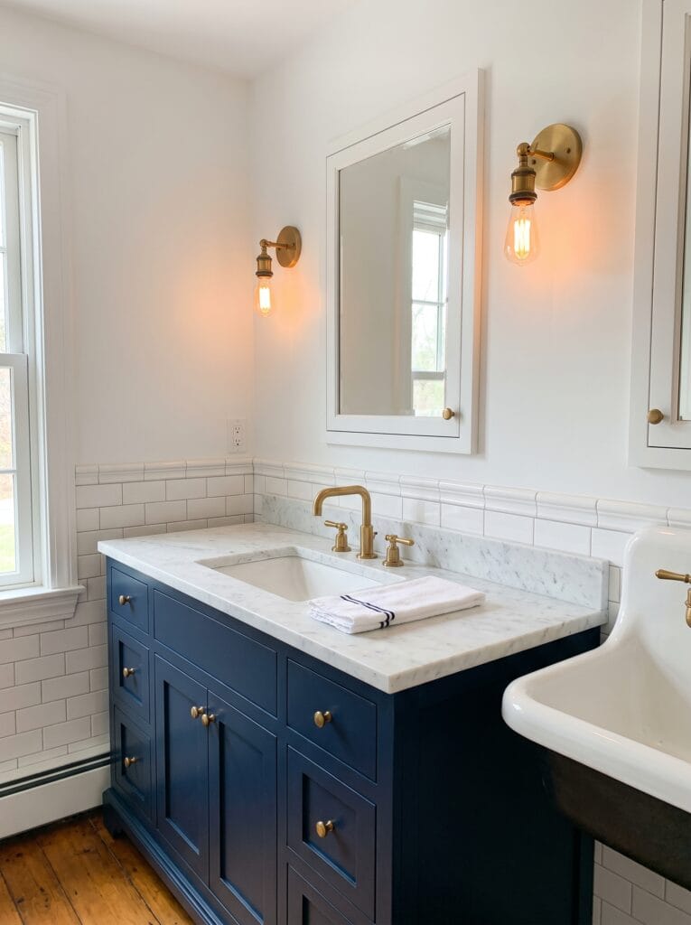
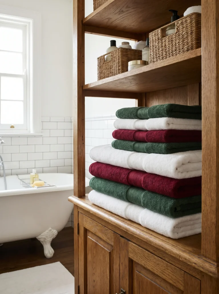
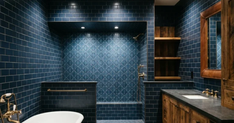
Navy blue works in a bathroom where paler blues fail, because it is dark enough to read as a neutral rather than as a color. That is why it survives next to white tile, white sanitaryware and a white ceiling without any of it looking accidental.
Brass is not optional in this scheme, it is the warming element. Navy and white alone run cold, and an unlacquered brass tap or handle set is what keeps the whole thing from feeling like a uniform. Our guide to the navy and gold bathroom color scheme goes deeper on getting that metal balance right.
Black and white only works if you hold it to two colors
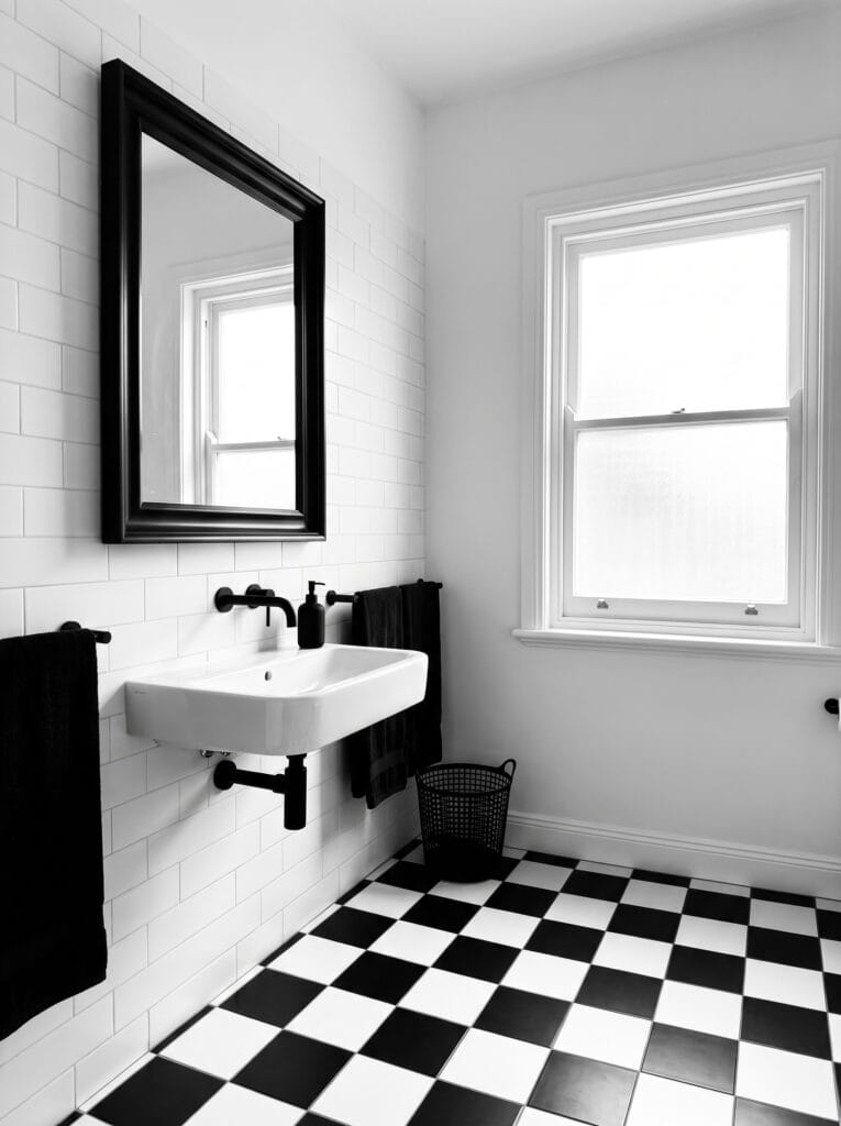
Most people who try black and white end up with black, white, chrome, a wood shelf and a green plant, and then wonder why it reads as busy rather than graphic. A true monochrome scheme means two colors and nothing else, including the metal.
The discipline is what creates the effect. Match the tap, the mirror frame, the towel rail and the bin to the same black, let the floor carry the pattern, and leave every other surface white. One stray warm tone anywhere and the whole scheme softens into something ordinary.
Terracotta warmed with cream suits a room that gets afternoon sun

Terracotta is an earth pigment, and like all earth pigments it needs warm light to look rich rather than dusty. A west-facing bathroom that catches low afternoon sun is where this scheme is at its best, because the light and the pigment are pulling in the same direction.
Cream rather than white is the partner you want here. Pure white next to terracotta exaggerates the orange and makes it look raw and slightly cheap, while a cream floor or basin lets the clay tone settle into something closer to plaster than to paint. The difference shows immediately.
Teal against natural stone gives you color without darkness

Teal sits between blue and green, which means it borrows the calm of one and the warmth of the other. That middle position is why it can go surprisingly dark on a wall and still not make a bathroom feel closed in the way a true navy does at the same depth of colour.
Pair it with a stone that has visible warmth in it, like travertine or a honeyed limestone. The pitted, uneven surface breaks up the flat expanse of colour and gives the eye somewhere to rest, which a smooth white countertop never quite manages.
Layer three tones of taupe and let the depth do the work
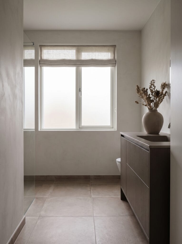
Taupe is the safest way to get a scheme that looks considered rather than beige by default. Sitting between brown and grey, it shifts character depending on what sits next to it, which makes it unusually easy to build a whole room around without anything in that room clashing.
The method is to use the lightest tone on the walls, a mid tone on the floor and the deepest on the vanity. Keeping everything in one family means nothing clashes, and the graduation from light to dark is what stops a monochrome room from reading as flat.
Blush pink opposite charcoal is the pairing nobody expects to work

Pink and charcoal sit far apart on the color wheel, and that distance is exactly why the combination holds together. Complementary colors make each other look more intense, so the pink reads warmer and the charcoal reads deeper than either would alone.
Keep the pink very pale and the dark tone genuinely dark. A mid pink against a mid grey turns muddy fast, because neither one is committed enough to anchor the other, and the room ends up looking undecided rather than deliberate. Distance between the two is what carries it.
Deep forest green with brass is the scheme for a room with no window
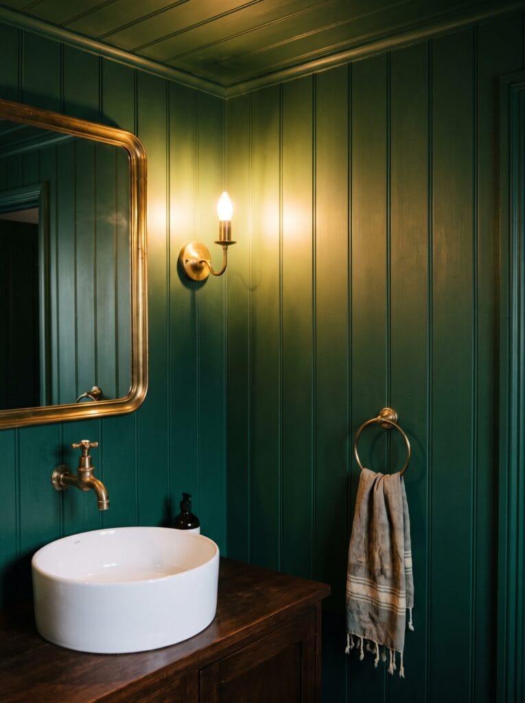
Dark colors are usually the first thing people rule out in a windowless bathroom, and that instinct is backwards. A pale colour under weak artificial light just looks grey and disappointing, while a deep green under the same light looks intentional and enveloping.
Brass is what keeps it from feeling like a cave. Warm metal catches every bit of available light and throws it back into the room, so a brass mirror frame, tap and towel ring effectively act as extra light sources without you adding a single bulb.
Beige grounded with ochre stops a neutral room going flat

Beige on its own is the most common bathroom scheme and the most forgettable. The fix is not to abandon it but to add one saturated earth tone that shares its warmth, and ochre is the natural candidate because it is essentially beige with the volume turned up.
Use it in textiles rather than on a wall. A round ochre rug, a folded towel and nothing else gives you the lift without committing to a colour that is genuinely hard to live with across a whole surface. Swapping a towel out next year costs nothing, and repainting does not.
Paint the bottom third and leave the rest white
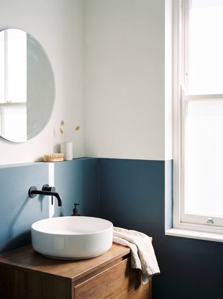
Two-tone walls give you a strong colour without the commitment of a full accent wall, and they suit rentals and small bathrooms particularly well. The painted band reads as panelling even when there is no panelling there, which adds a sense of structure to a plain box.
Height is the only decision that matters. Around a third of the wall is the sweet spot, and landing the line level with the top of the vanity or a window sill makes it look designed rather than arbitrary. Tape it properly, because a wavy line ruins the effect instantly.
A powder room is where you go fully saturated

Small, windowless rooms that nobody spends more than two minutes in are the safest place in the house to be brave with colour. There is no daylight to fight, no risk of tiring of it, and the intensity that would overwhelm a family bathroom becomes the entire point.
Take the colour over the ceiling as well. Stopping at the wall line in a tiny room draws a hard border around the space and makes it read smaller than it is, while carrying the same saturated tone overhead removes the edges completely and the room stops having a measurable size.
Three tints of one hue is the quietest scheme here

Pick one hue and vary only how much white is mixed into it. A tint is that hue plus white, so three tints of a single blue give you visible depth and no risk at all of a clash, because there is only ever one colour in the room and the eye reads the variation as light.
Put the palest on the ceiling, the mid tone on the walls and the deepest on the vanity. That order matches how light naturally falls and keeps the room feeling tall. For more ways to handle a single colour across a whole bathroom, see our blue bathroom ideas.
Split the room sixty, thirty, ten

The oldest rule in colour scheming is also the most useful one: roughly sixty percent of the room in a dominant neutral, thirty in a secondary colour, and ten in an accent. It is not a law, but it explains why some rooms feel balanced and others feel loud.
The ten percent is where people go wrong. An accent is meant to appear in two or three small places, like a tap, a mirror frame and a stripe on a towel, and the moment it spreads to a fourth surface the proportion breaks and the room starts to feel busy.
Match the paint to the tile you are not replacing

Here is the check that saves the most money and almost nobody does first. Your existing floor tile, countertop and any tiled walls already have an undertone, and if the paint fights it the room will look wrong no matter how good the colour is on its own.
Hold the sample against the tile in the actual room, not in a shop and not on a screen. Cool grey marble needs a grey with blue in it; a cream travertine needs something with yellow. Getting this one comparison right eliminates most of the shortlist immediately.
Peel-and-stick swatches beat paint pots for this, because you can move them around the floor, stand them against the counter and hold them next to the tap, then take them off without repainting anything. They also cost a fraction of a tester tin and leave no patches behind.
Test the palette under the bulb you actually own

This is the single biggest reason a bathroom color scheme fails, and it has nothing to do with the colour. A 2700K bulb throws warm, yellowish light that pushes every cool grey towards beige, while a 4000K bulb does the reverse and drains the warmth out of creams and blushes.
Colour rendering index matters just as much and is even more overlooked. A cheap bulb at CRI 80 flattens saturated colours, so your expensive green reads as a dull sage on the wall. Anything rated CRI 90 or above shows the colour you actually paid for.
Buy the bulb before you buy the paint. Fit it, live with it for an evening, then hold your samples up at night as well as in daylight, because a bathroom gets used at both ends of the day and a colour that works at noon can fall apart at seven in the evening.
Drench the whole room in one shade, ceiling and trim included
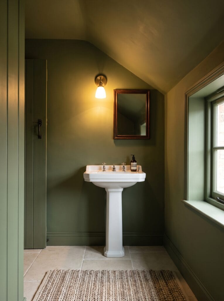
Colour drenching means painting every surface the same shade: walls, ceiling, skirting, door and window frame. It sounds extreme and it is actually the most calming thing you can do to an awkwardly shaped room, because it erases every line that was drawing attention to the awkwardness.
Sloped ceilings, boxed-in pipes and odd corners all disappear when there is no contrast marking where one plane ends and the next begins. Use a mid-depth muted colour rather than a very dark one, or a small bathroom will lose its sense of depth entirely.
Chocolate brown with cream is the scheme coming back fastest

Brown spent two decades as the colour nobody would touch, and it is back because it does something grey never could: it makes a bathroom feel warm without making it feel pink or yellow. Deep chocolate reads as rich rather than dated the moment it is paired correctly.
Cream above the panelling is what dates it or saves it. A brilliant white upper wall against brown looks like a 1970s bathroom immediately, while a soft cream keeps both tones inside the same warm family and reads as a considered pairing rather than a leftover one.
Lavender held down by warm grey avoids the nursery problem

Lavender has an obvious risk, which is that it tips into looking childish very easily. The fix is to weight the bottom of the room with something distinctly grown-up, and a warm grey-brown vanity does that better than a white one ever will.
Keep the lavender genuinely pale, close to off-white with a violet cast rather than a true purple. At that dilution it behaves like a neutral in daylight and only reveals itself as a colour in the evening, which is exactly what you want in a bathroom.
Mustard as the only warm note in a charcoal room

A dark tiled bathroom needs one warm accent or it reads as unfinished rather than moody. Mustard is the best candidate because it is the complementary partner to the blue undertone most charcoal tiles carry, so it lifts the grey instead of sitting on top of it.
Keep it entirely in textiles. A towel and a bath mat give you the accent at roughly the right proportion without any commitment, and unlike paint or tile you can change your mind next season for the cost of a towel rather than a weekend and a skip.
Shop it on Amazon : Jacquotha Mustard Yellow Cotton Bath Towels, Pack of 2
Coastal blue-grey with sand and rattan needs real daylight
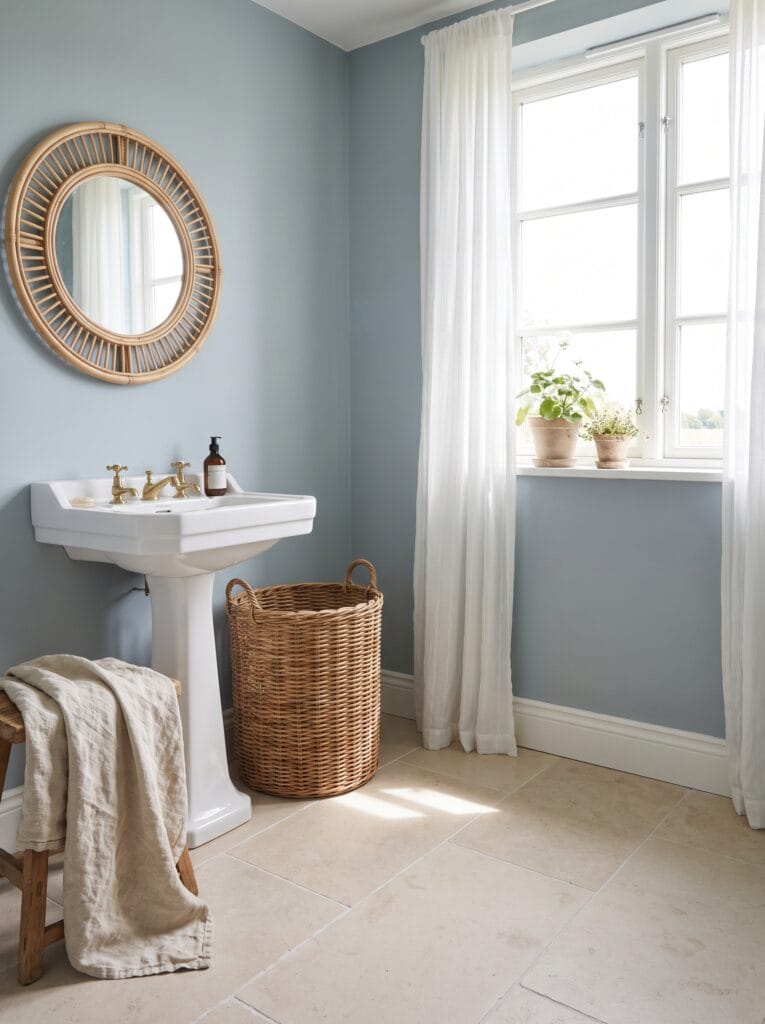
This is the one scheme on the list that genuinely depends on having a decent window. Blue-grey is a low-saturation colour, and low-saturation colours need plenty of light or they collapse into plain grey and lose the whole coastal reference.
Sand-toned flooring and natural fibre are what make it read as coastal rather than corporate. Rattan, wicker and unbleached linen all bring in a warm mid tone that stops the blue-grey from feeling cold, and none of them require a single extra coat of paint.
Japandi is warm white, black and pale wood, in that order

Japandi is really a proportion rule wearing a style name. Warm white covers most of the room, pale wood takes the largest single object, and black appears only in the smallest details, which is the sixty-thirty-ten split with a specific palette attached.
The restraint is the point, so the hardest part is stopping. One black tap and one black mirror frame is the whole quota, and adding a black bin, a black rail and black shelf brackets on top of that turns a calm room into a monochrome one that happens to have wood in it.
Ivory on ivory is warmth without any contrast at all

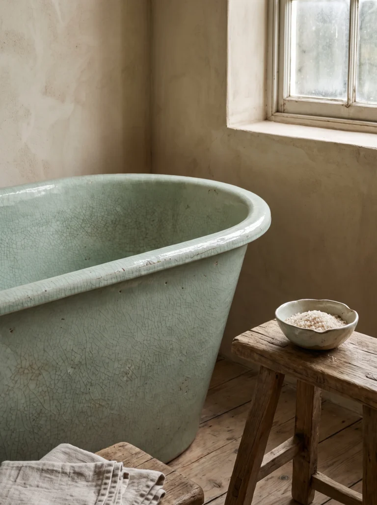
Some bathrooms do not want contrast, they want softness, and the way to get it is to build the entire room from tones that differ only in warmth rather than in lightness. Ivory, bone, chalk and oyster all read as the same colour until you look properly.
Texture has to carry the room when colour is not doing it. Rough plaster, a hewn stone basin and a slubby linen towel give the eye enough variation that the space feels rich rather than washed out, which flat paint on every surface would not.
Plum against soft white is the boldest scheme that still reads classic

Plum is the dark colour to choose when navy feels too safe and black feels too hard. It carries enough red to stay warm under artificial light, which is where most deep colours in a bathroom fail, and it sits comfortably against the white sanitaryware you already have.
Gold hardware rather than chrome is what tips it from moody into elegant. The warm metal picks up the red in the plum and ties the two together, while chrome introduces a cool note that leaves the vanity looking slightly detached from the rest of the room.
Pick the sheen before you pick the color
Finish is the part of choosing bathroom paint colors that gets decided last and causes the most regret. Flat and matt paints hold moisture and mark permanently when wiped, which in a room that gets steamed twice a day means visible patches within two winters.
Satin and eggshell are the right range for bathroom walls. They carry enough resin to be wiped clean and to shed condensation rather than absorb it, and the slight sheen bounces a useful amount of light around a room that usually does not have much daylight to spare.
Sheen also changes the colour itself. The same paint reads roughly a shade lighter in satin than in matt because it reflects more light back at you, so if you tested a matt sample and buy satin, expect the wall to come out paler than the swatch.
In a bathroom with poor ventilation, a dedicated mould-resistant formula is worth the extra over a standard satin. It will not fix an airflow problem and it is no substitute for a working fan, but it buys you several years before anything shows on the wall above the shower.
Three checks before you commit to one of these bathroom color schemes
Every one of these bathroom color ideas comes down to the same three questions, and answering them takes an evening rather than a weekend. Hold the sample against the fixed elements first, because the tile and countertop have already narrowed your options whether you like it or not.
Then look at it under your own bulb, at night, with the door shut, which is the condition most of a bathroom’s life actually happens in. And choose satin or eggshell before you commit, since the finish shifts the colour and decides how the wall survives the steam.
Get those three right and almost any of these bathroom color schemes will work in your room, including several you would have ruled out on a screen. The colour is genuinely the last decision, not the first. For more colour-led rooms and the styles they belong to, browse our bathroom styles and aesthetics collection.
Found a palette worth trying? Save this pin so you have it with you when you are standing in front of the paint display.