
18 Green Tile Bathroom Ideas That Match Your Actual Light
Green tile fails in bathrooms for one reason more than any other: the shade gets chosen on a screen instead of against the light in the actual room. A crisp emerald that looks alive in a south-facing bathroom turns cold and grey by three in the afternoon in a north-facing one.
Match the green to your light first, and every style choice after that becomes far easier. So the eighteen ideas below are grouped by the light your room actually gets, not by shade name the way most galleries do it.
Find your own situation first, then choose from inside that group. Four groups cover almost every bathroom in the country. North-facing and cool, south-facing and warm, windowless, and rooms that are simply too small. The final three ideas cover finish and grout, which shift the colour as much as the tile itself does.
Those two decisions quietly ruin more green bathrooms than the choice of shade ever has.
Some links below are affiliate links. They cost you nothing extra and help keep this site running.
Table of Contents
Pick a sage with yellow in it if your window faces north
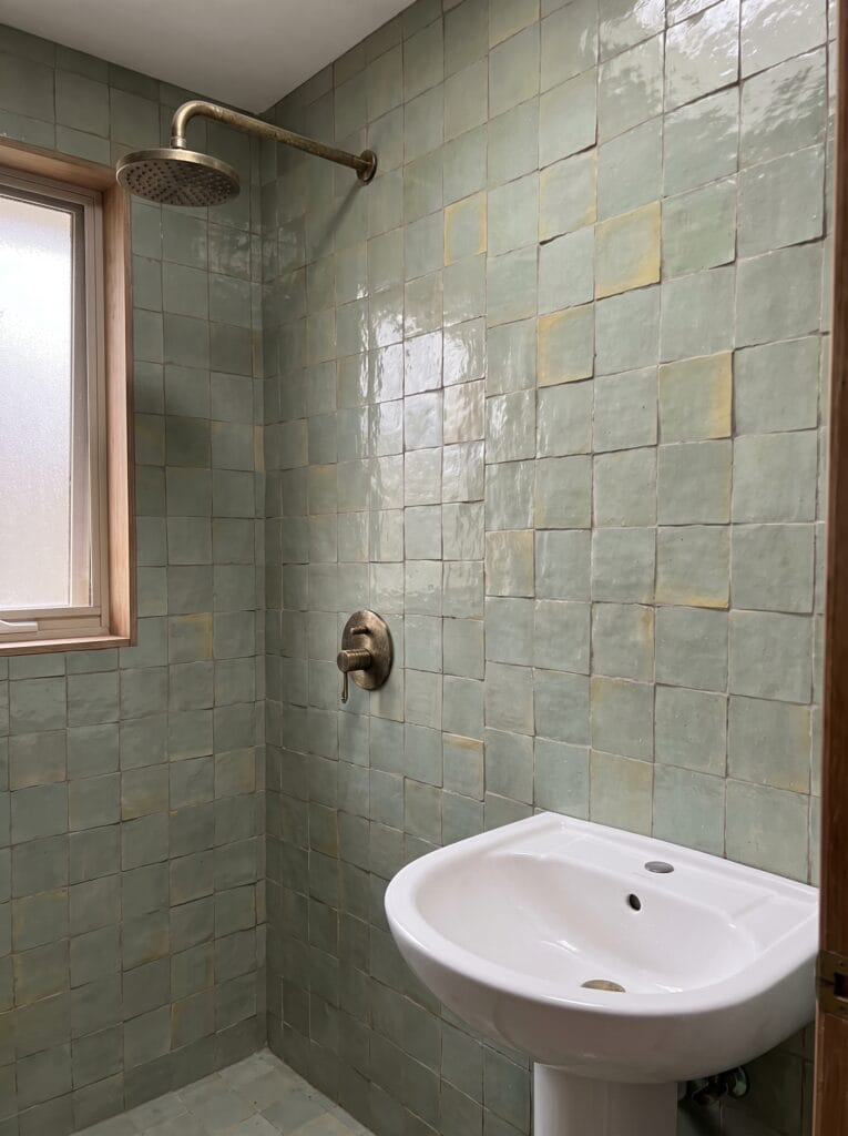
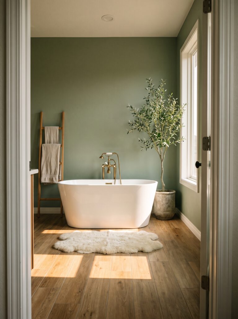
Choose a sage that carries visible yellow or grey down in its base when the room faces north. Northern daylight arrives flat and faintly blue, and it strips the warmth out of any green that started cool to begin with.
Mint and seafoam are the usual casualties, reading as hospital corridor rather than calm retreat.
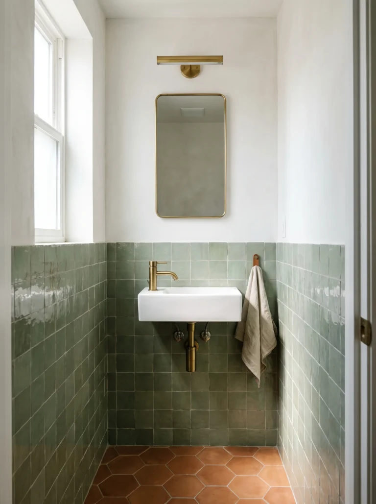
Handmade zellige helps in this light because the glaze pools unevenly across every single piece.
Some tiles catch more of what little daylight there is than their neighbours do, so the wall keeps a bit of movement even on a grey afternoon when flat machine-made tile would go completely dead.
Warm brass fittings push that same wall further in the right direction, while chrome quietly drags the whole thing back toward the cold end you were trying to avoid.
Let olive carry the warmth when the daylight is flat

Olive earns its place where sage feels too pale and emerald feels far too loud. Its brown undertone behaves like a warm neutral rather than a colour, so a whole wall of it never shouts at the room, and it sits beside limestone and pale oak the way a natural stone would.
Lighter flooring matters more here than with almost any other green.
Set olive above a dark floor in an already dim room and the bottom half of the space closes in on you, whereas limestone or light oak bounces whatever daylight exists back up into the tile itself.
Keeping the vanity in a similar wood tone pulls the scheme together, so the room reads as deliberate rather than simply dark.
Warm the grout, not the tile, in a dim room

Swap bright white grout for ivory or bone whenever the room is dim and the tile is dark. Stark white against deep green creates a hard grid that the eye reads as contrast first and colour second, which makes an already gloomy bathroom feel busier rather than lighter.
Beveled tile amplifies whatever decision you make about grout colour.
Every sloped edge catches light along its own line, so the joint pattern is already doing plenty of visual work before grout even enters the conversation, and a softer joint stops that tipping into noise. Mount one small brass sconce close to the tile rather than relying on a ceiling fixture.
Raking light across a beveled surface from the side shows texture that an overhead fitting flattens completely.
Go darker on purpose when the light is already low
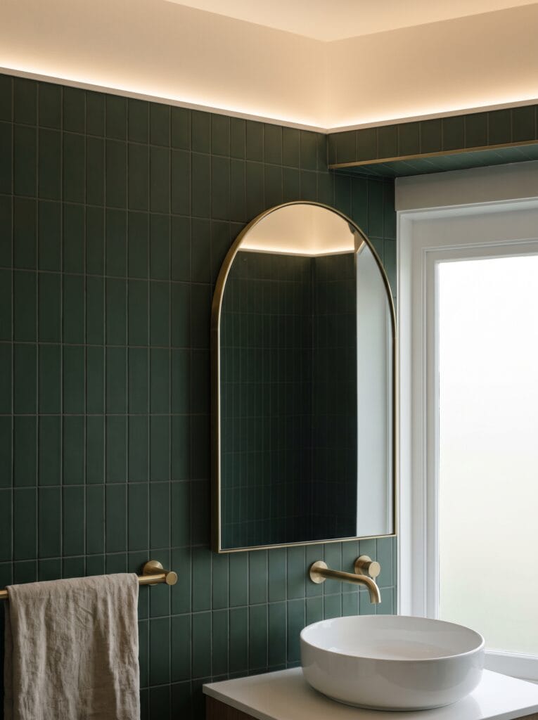
Stop trying to brighten a genuinely dark bathroom and commit to the darkness instead.
Pale greens in a room with very little daylight end up looking muddy rather than airy, because there is not enough light for them to reflect, while deep forest green reads as a decision somebody made on purpose. Balance in a room like this comes from the ceiling rather than the walls.
Leaving that ceiling warm white above dark tile gives the eye somewhere bright to rest, and a large arched mirror quietly doubles whatever daylight manages to find its way into the space.
Vertical stacked tile suits this approach best, because the upward joint lines keep pulling the eye toward that lighter ceiling rather than along the wall.
Save the crisp emerald for a room that gets real sun
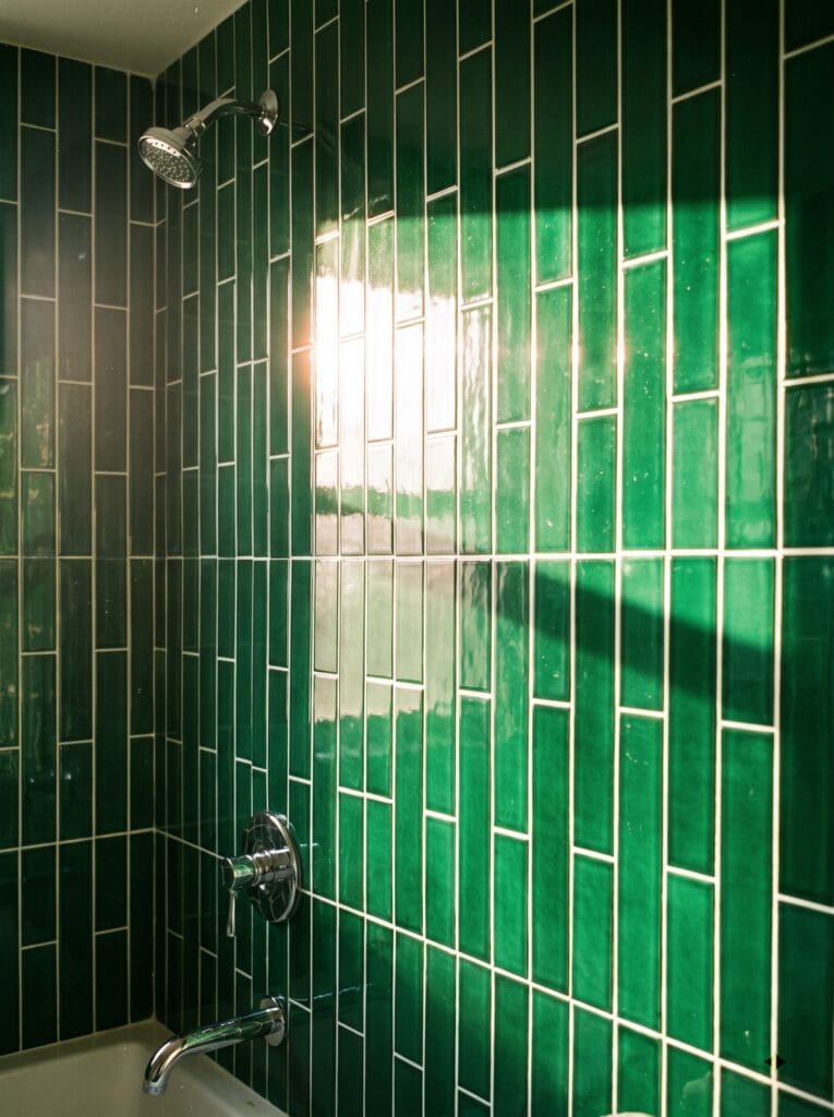
Emerald needs direct sunlight to deliver the thing people actually buy it for.
Under a south-facing window the glaze goes deep and properly saturated, and the entire wall shifts in tone as the sun tracks across the room, which is exactly the effect that sells it in photographs.
Stack the tile vertically rather than running the usual offset brick bond. Vertical joints draw the eye up the wall and suit the tall narrow proportions of most shower enclosures, and that pattern stays readable even when strong sunlight is blowing out half the surface.
Chrome is the better metal in a room like this, because warm brass ends up competing with light that is already warm rather than complementing it.
Scatter the light with a small-format floor in a bright room
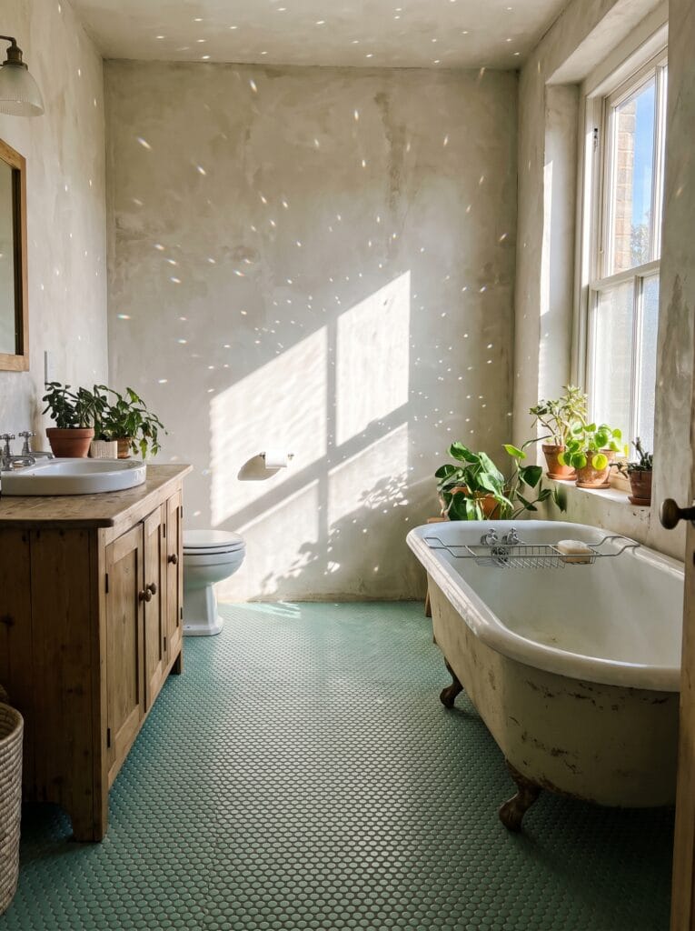
Lay seafoam penny rounds across the floor when the room already floods with afternoon sun. Each tiny tile carries its own slight curve and catches light at a marginally different angle.
Glare scatters across hundreds of small surfaces instead of bouncing back at you in one hard sheet. Grout quietly does most of the work in a pattern this small.
There is far more of it per square foot than with any larger format, so its colour effectively becomes a second colour in the room and deserves the same care and attention as the tile choice itself.
Plaster walls kept pale above a floor this busy stop the room tipping into restless, and they let the pattern underfoot stay the interesting thing.
Put the strongest green underfoot when the walls are already lit

Move the colour down to the floor when your walls already carry plenty of daylight. Jade hexagons underfoot give a sunlit bathroom genuine colour without darkening a single vertical surface, and white wall tile above keeps the whole space bouncing light back and forth.
Hexagons earn their keep in a wet zone for entirely practical reasons as well.
All those joint lines give bare feet considerably more grip than a large-format tile ever could, which matters far more on a shower floor than any visual argument about pattern.
Set a slim linear brass drain into the green so it reads as a deliberate detail rather than an interruption running through the pattern.
Use pattern instead of colour when the sun does the work
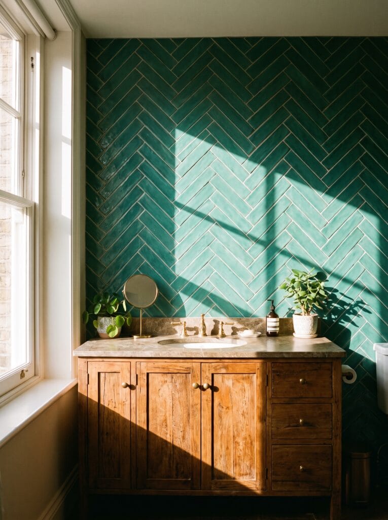
Let the layout carry the interest when the light coming in is already strong.
Herringbone sets every tile at an angle to its neighbour, so each piece catches the sun slightly differently and the wall keeps shifting through the day without anybody needing a louder colour.
Teal sits in the gap between green and blue and handles this pattern unusually well. It stays readable under bright light where a darker green would flatten into one solid block, and the diagonal lines keep the whole wall from drifting toward cold on an overcast day.
Warm wood beneath a teal wall anchors the arrangement and stops the room reading as a seaside theme rather than a considered scheme.
Choose gloss over matte when there is no daylight at all
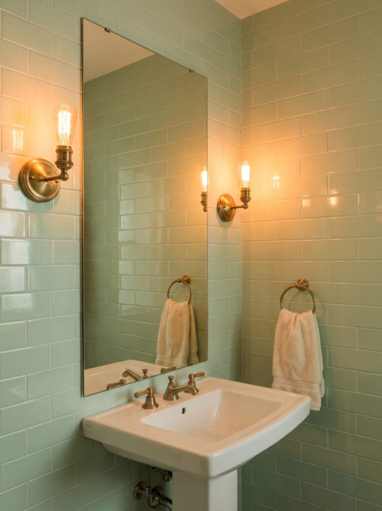
Always take the glossy finish in a bathroom with no window at all.
Matte tile absorbs the little light a windowless room has to offer, whereas a glazed surface throws it straight back and spreads a single bulb across a far larger area of wall than seems possible. Mint suits this job better than any deep shade could manage on its own.
Lighter greens have more to give back in the first place, and two warm sconces bouncing off a glossy mint wall will light a powder room far more evenly than a single fixture overhead.
Position those sconces either side of the mirror rather than above it. Front lighting removes the shadows that overhead fittings throw under eyes and chin.
Let a backlit mirror do the job a window would
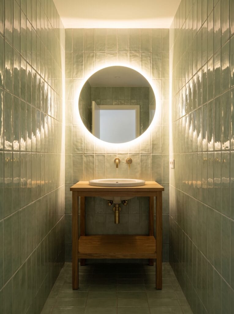
Hang a backlit mirror when there is no daylight in the room to reflect in the first place. The glow behind the glass gives the surrounding tile something to catch, so the glaze stops looking flat and starts behaving roughly the way it would beside a real window.
Sage is much the safer shade for this particular trick, and deep greens are the riskier one.
Dark tile swallows artificial light rather than returning it, while a lighter glaze lets the halo spread several tiles wide instead of dying at the frame edge. Specify warm white rather than cool white in the fitting, because a cool bulb pulls the yellow out of almost every green and leaves grey behind.
Stop the tile at half height to keep a windowless room open

Run the tile to roughly chest height and paint everything above it in a windowless room.
Green covering every surface in a space with no daylight gets heavy very quickly, and stopping partway up leaves the upper half of the room free to reflect light back down.
Renting changes this calculation entirely, and a removable version gets most of the effect.
Something like VEELIKE Retro Green Subway Peel and Stick Tile covers a half wall for very little money and comes away cleanly at the end of a tenancy without taking the paint with it.
Get it in amazon : VEELIKE Retro Green Subway Peel and Stick Tile.
Finish that top edge with a proper trim or bullnose piece, because a raw cut tile edge is the detail that makes the whole wall look temporary.
Reach for glass mosaic when one downlight is all you have

Glass mosaic earns its cost in a shower lit by one recessed fixture. Light passes into each small piece and reflects off the wall behind it rather than bouncing straight back off the surface. The whole enclosure glows instead of producing a single hard hotspot under the fitting.
Depth is the practical benefit most people only notice afterwards.
A flat ceramic wall under a single downlight shows exactly where that light lands and exactly where it does not, whereas glass carries the same output much further across the enclosure.
Expect to pay considerably more per square foot, which is why glass suits a single small shower rather than an entire room.
Run one green everywhere instead of breaking up a small room
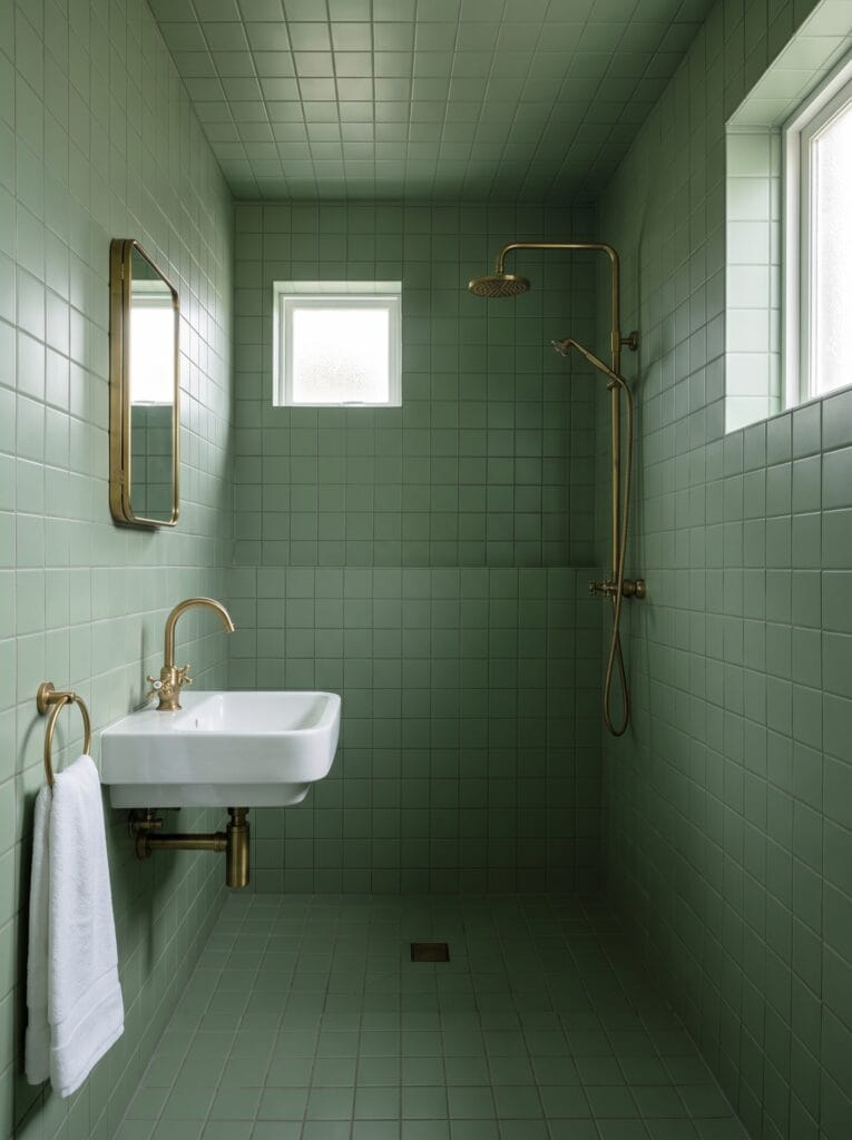
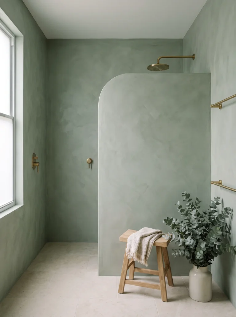
Take one sage across floor, walls and ceiling when the room is genuinely small.
Every change of material hands the eye another boundary to measure, and a small bathroom broken into three separate finishes reads as three cramped surfaces rather than one calm volume. Colour drenching sounds risky and behaves the opposite way in practice.
Without contrast lines the corners stop announcing themselves, which is the same logic behind an earthy green spa bathroom where a single tone is left to carry the entire scheme from floor to ceiling.
White sanitaryware supplies every bit of contrast a room treated this way actually needs, which is why a plain basin serves it better than a coloured one.
Drop the grout lines, not the colour, in a tight shower
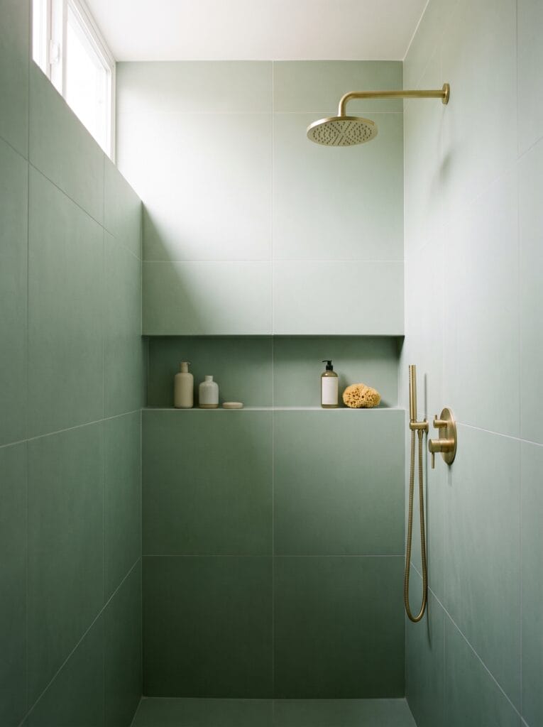
Use large-format porcelain in a small shower and cut the number of joints right down. Grout lines are what the eye counts when it judges how big an enclosure is, so four big panels read as far roomier than sixty small squares covering exactly the same area of wall.
Cleaning improves at the same time, which nobody mentions in the showroom. Less grout means less of the porous material that traps soap residue and grows the dark lines people lose weekends scrubbing out of a shower. Sealing what remains takes about ten minutes a year.
Build a recessed niche from the same tile so storage disappears into the wall rather than hanging off it. Nothing makes a small shower feel tighter than a rack bolted across the corner.
Tile the back wall only to stretch a narrow room
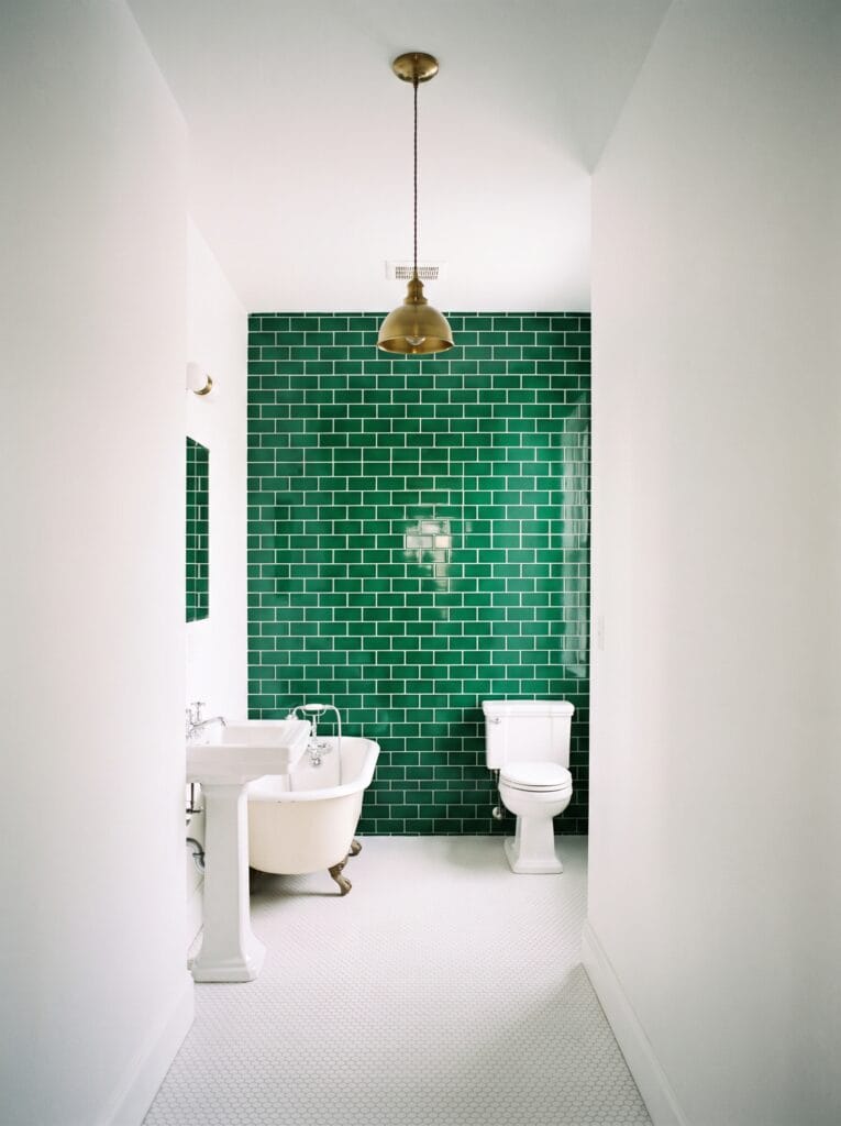
Put the green on the end wall only and leave both long sides white in a narrow bathroom. Colour at the far end works as a destination and draws the eye down the length of the room, while pale side walls stop the space reading like a corridor you simply pass through on the way somewhere else.
Budget improves noticeably as a side effect of exactly the same decision.
One wall of genuinely good emerald costs a fraction of what tiling an entire room would, which frees up real money for the taps and handles that people put their hands on daily. Hang a pendant centrally over that wall to finish the trick, because a light source at the far end confirms where the room ends.
Test gloss against matte before you commit the whole wall
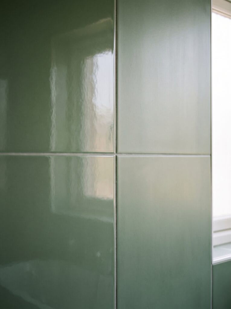
Order both finishes of your chosen green before committing to the full quantity.
The same glaze reads as two genuinely different colours depending on finish, because gloss reflects whatever light surrounds it while matte absorbs and shows you the pigment entirely on its own. Tape the samples side by side on the wall they will live on and leave them a full day.
Morning light and late afternoon light will disagree with each other, and the finish that wins at breakfast is frequently not the one that wins at six in the evening. Gloss wins in dark rooms almost every time. Matte suits bathrooms that already have sunlight to spare and want the colour calmer.
Decide the grout colour before the tile colour
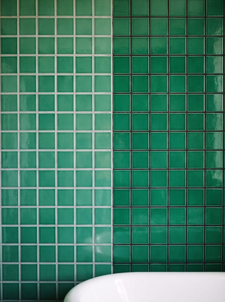
Treat grout as a design decision rather than an afterthought at the bottom of a quote. Soft grey joints let a green wall read as one field of colour, while charcoal turns identical tile into a graphic grid where the pattern arrives before the colour ever does.
Existing grout can be changed without touching a single tile. A White Grout Pen for Tile Restoration lifts tired grey joints back to a clean line in an afternoon, which is much the cheapest way to reset a green wall you have grown bored of looking at.
Get it on Amazon : White Grout Pen for Tile Restoration.
Dark grout hides general dirt but shows limescale clearly, so hard water areas should think twice before choosing charcoal joints.
Buy handmade only if you want the wall to move
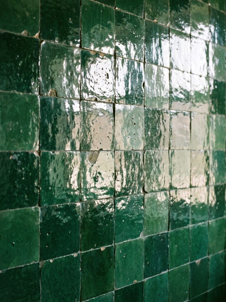
Understand exactly what handmade tile delivers before paying the premium attached to it. Zellige and similar glazes vary from piece to piece, pool in the corners and finish with edges that are visibly not straight, so the wall genuinely changes as you walk past it.
People who want an even wall should avoid the whole category entirely.
Each characteristic that makes handmade tile interesting counts as a flaw by the standards of machine-made porcelain, and nobody should pay extra for a look they were quietly hoping to avoid.
Buy around fifteen percent extra rather than the usual ten, because the variation means some pieces will refuse to sit happily beside each other.
What makes green tile look cheap
Almost every green bathroom that disappoints fails on execution rather than on colour. Five habits account for most of it, and each one has a straightforward replacement that costs nothing extra.
- Not this: bright white grout against a deep green. This instead: ivory or warm grey, which softens the grid rather than shouting it.
- Not this: a raw cut tile edge at the top of a half wall. This instead: a matching trim or bullnose, which is the clearest single tell between a professional job and a weekend one.
- Not this: three different greens in one small room. This instead: one green and one neutral, with the variation coming from finish or format.
- Not this: cool white bulbs over a green wall. This instead: warm white, because cool light pulls the yellow out and leaves grey behind.
- Not this: matching your tile to a photograph taken in somebody else’s house. This instead: a sample taped to your own wall and watched across a full day.
Trim and grout are where the money shows. Both cost very little relative to the tile, and both are exactly where an otherwise good bathroom gives itself away.
Hold a sample against your own wall at three in the afternoon
Order samples of two greens rather than committing to anything from a screen.
Tape both to the wall they will actually live on, then look at them first thing in the morning, again in the middle of the day, and once more in late afternoon when the light has gone flat. One of the two will fail at a specific hour, and that failure is the entire test.
North-facing rooms usually lose the cooler sample by mid-afternoon, while south-facing rooms tend to reject whichever green looked safest under the lighting in the shop. Whichever shade survives all three looks is the one to buy, and no photograph online will ever run that test on your behalf.